Brief Summary The website provides an easy way for someone to select, and hire, a lawyer. By posting their case details on the website, the user does not have to repeat themselves to each lawyer …

SpiritCurves
Artist website I made for SpiritCurves.com
Provide Feedback Please
When logging into an account needed only once per year, I received this message. What does it mean? It doesn’t tell me what I did wrong. Is it me? Is it you? This type of …
Talks with Susan
My talks with Susan were very beneficial because my artist-self needed direction, even when I didn’t know I needed direction. When I went through those moments of self doubt, Susan drew upon her own experience …
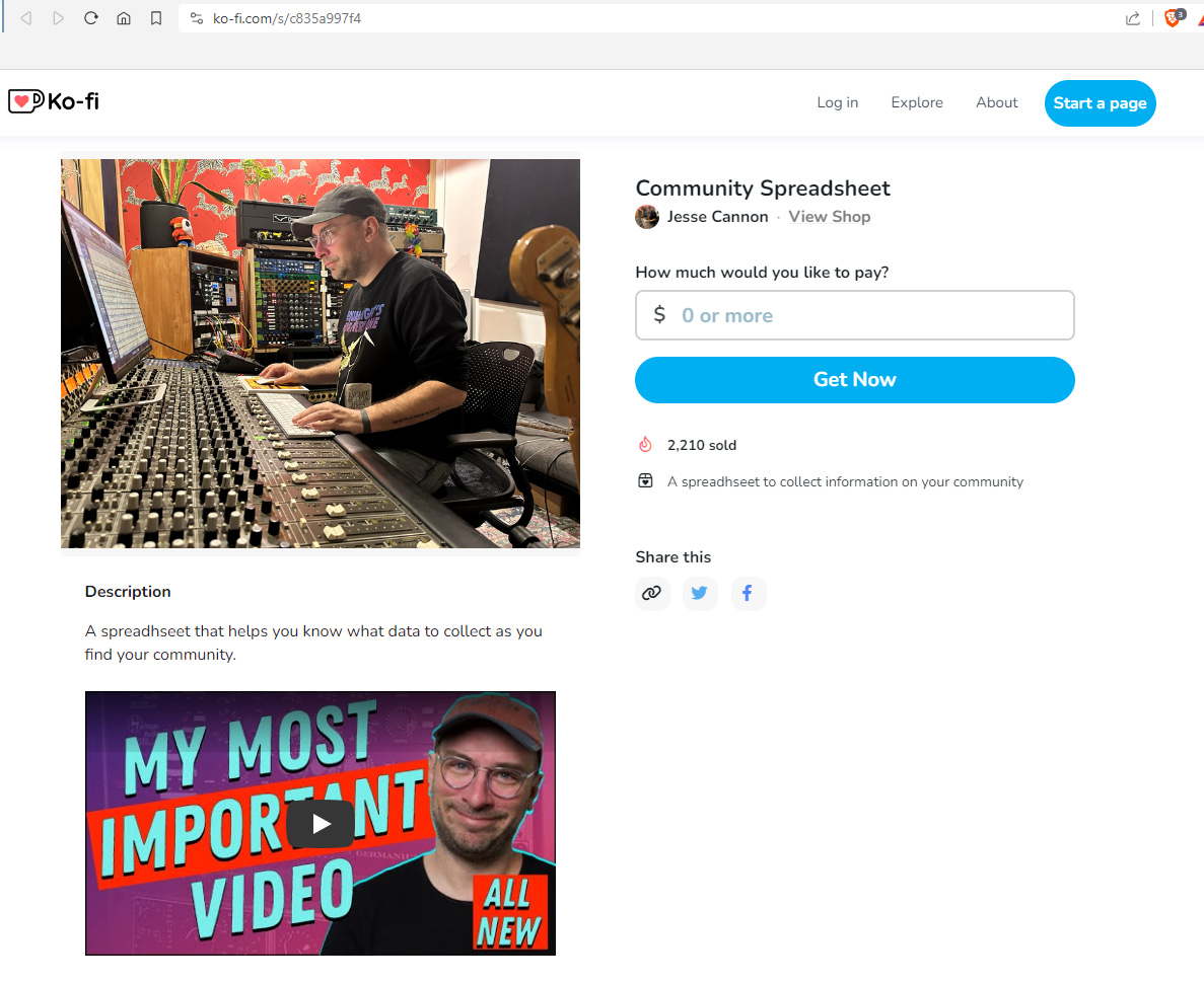
How much would you like to pay?
Example of offering a valuable spreadsheet behind a wall that says “How much would you like to pay?” I can continue on and pay 0 when I give over my email address, which I did. …

Krewe Practice 4/5/23
Looking for 2 sets for Memorial weekend (Revival). Start with Steve Baird list from 5-7-22, add and subtract as we go along. BAND SPREADSHEET: https://docs.google.com/spreadsheets/d/19FjB-iTxNlp9xxw7CYgekKJzdYIEFEZdzDiKnwAtZUo/edit?usp=sharing Next Practice: Friday, 4/23/23 8-10pm All you do is bring …
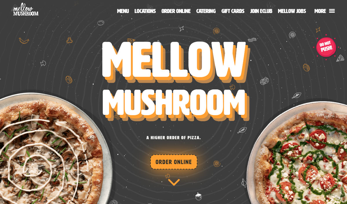
Mellow Mushroom
A 2023 design example that I just love, cataloging here for inspiration. I like the CSS effect that follows the mouse, giving a trippy feel to the title in the hero area. It’s just the …

Portrait of a Stranger
I went to the Sandy Springs dog park for my portrait of a stranger challenge. I used a big round softbox that I love using for portraits because of the soft even light. I purposely …

Jamkazam 1-4-23
With Doug, these are the songs we went over on 1/4/23: All you do is bring me down, G DD G, Walking! not bluegrass. Mavericks https://youtu.be/XamDeKZEJYo Country Comfort, G, Elton John https://youtu.be/6vlPgDhIzKM Ooh la la, …
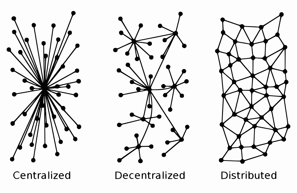
Mastodon Research
Exploring the history, capabilities, and negative backlash of the web3 social platform. Fediverse, Decentralized, Web3.0 ActivityPub is the protocol used to exchange data on web3.0. Instead of 1 person/company hosting web files (godaddy.com, bluehost.com, etc.), …