Project Scope
Accomplishments
- Create high level implementation strategy to meet business requirements
- Verify that we understood project vision with stakeholders
- Drive overall engineering of product design
- Translate business strategy into technical needs
- Plan content strategy for delivering targeted data
- Utilize immediate engagement while protecting health data
- Create rapid prototype
- Conducted user testing and make revisions to design
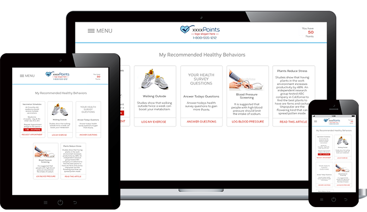
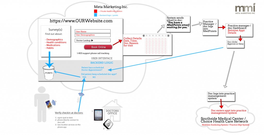
The Medical Director of a local healthcare network wanted his patients to have an app and accompanying website. He wanted to utilize technology to affect the patient’s behavior, resulting in higher attendance rates to scheduled doctor’s appointments. The app would provide an easy way to make a doctor’s appointment, then give reward points for keeping the appointment. The app would also collect demographic and health data that would be shared with their doctor by administering a series of surveys. Data is analyzed to target specific users with higher health risks, and tailors the information towards that user’s condition in the form of recommended behaviors.
First: Clarify Requirements into Actionable Items:
- Record healthy behaviors and assign points
- When user is ready to redeem points, present the signup process
- Protect sensitive health data while matching app users to secure healthcare records
- Collect member’s demographic data
- Redemption process and rewards library
- Request doctor’s appointment
- Companion website for desktop
Competitive Analysis
Several healthcare apps and rewards apps were examined for functionality and ease of use:
- Mango Health
- Spot On
- Coca-Cola Rewards
User Personas
Users of the app were anticipated to be the indigent with smartphones. Creating user personas allowed me to discover the thrifty-minded person would also engage with the app, a “get something for free” mentality. Jump to the user personas.
User Workflows
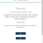
Several challenges needed to be addressed with the project scope, such as how to engage the user without slapping them with a large signup process on the first screen? Read more about how the user workflows were addressed in Healthcare App User Workflows.

Prototype
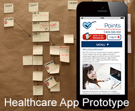
I built a quick prototype in HTML5 and CSS3 to work out the user flows. This allowed everyone involved to start discussions about what this thing was supposed to be doing. Read more and see the app in the Healthcare App Prototype article.

Usability Testing
I had 5 users to test with. Testing was done immediately after the first rough draft of the prototype to start the revision process. Read more about test questions, findings, and see the videos of user testing on the Healthcare App User Testing article.
