Keeping for my toolbox:
/*
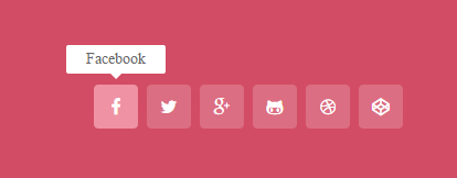
Social media icons by Kieran Hunter
contact me for any questions
kieranhunter.co.uk
*/
<div>
<a href=”#”><span>Facebook</span></a>
<a href=”#”><span>Twitter</span></a>
<a href=”#”><span>Google+</span></a>
<a href=”#”><span>Github</span></a>
<a href=”#”><span>Dribble</span></a>
<a href=”#”><span>CodePen</span></a>
</div>
body {
background-color:#d34c65;
text-align:center;
}
/* icon container with excessive gradient */
div {
display: inline-block;
margin-top:125px;
background: -moz-linear-gradient(top, rgba(255,255,255,0) 20%, rgba(211,76,101,1) 70%);
background: -webkit-gradient(linear, left top, left bottom, color-stop(20%,rgba(255,255,255,0)), color-stop(70%,rgba(211,76,101,1)));
background: -webkit-linear-gradient(top, rgba(255,255,255,0) 20%,rgba(211,76,101,1) 70%);
background: -o-linear-gradient(top, rgba(255,255,255,0) 20%,rgba(211,76,101,1) 70%);
background: -ms-linear-gradient(top, rgba(255,255,255,0) 20%,rgba(211,76,101,1) 70%);
background: linear-gradient(to bottom, rgba(255,255,255,0) 20%,rgba(211,76,101,1) 70%);
filter: progid:DXImageTransform.Microsoft.gradient( startColorstr=’#00ffffff’, endColorstr=’#d34c65′,GradientType=0 );
}
/* Icons */
a {
color:#fff;
background: #DB6E82;
border-radius:4px;
text-align:center;
text-decoration:none;
font-family:fontawesome;
position: relative;
display: inline-block;
width:40px;
height:28px;
padding-top:12px;
margin:0 2px;
-o-transition:all .5s;
-webkit-transition: all .5s;
-moz-transition: all .5s;
transition: all .5s;
-webkit-font-smoothing: antialiased;
}
a:hover {
background: #ef92a3;
}
/* pop-up text */
a span {
color:#666;
position:absolute;
bottom:0;
left:-25px;
right:-25px;
padding:5px 7px;
z-index:-1;
font-size:14px;
border-radius:2px;
background:#fff;
visibility:hidden;
-o-transition:all .5s cubic-bezier(0.68, -0.55, 0.265, 1.55);
-webkit-transition: all .5s cubic-bezier(0.68, -0.55, 0.265, 1.55);
-moz-transition: all .5s cubic-bezier(0.68, -0.55, 0.265, 1.55);
transition: all .5s cubic-bezier(0.68, -0.55, 0.265, 1.55);
}
/* pop-up text arrow */
a span:before {
content:”;
width: 0;
height: 0;
border-left: 5px solid transparent;
border-right: 5px solid transparent;
border-top: 5px solid #fff;
position:absolute;
bottom:-5px;
left:40px;
}
/* text pops up when icon is in hover state */
a:hover span {
bottom:50px;
visibility:visible;
}
/* font awesome icons */
a:nth-of-type(1):before {
content:’\f09a’;
}
a:nth-of-type(2):before {
content:’\f099′;
}
a:nth-of-type(3):before {
content:’\f0d5′;
}
a:nth-of-type(4):before {
content:’\f113′;
}
a:nth-of-type(5):before {
content:’\f17d’;
}
a:nth-of-type(6):before {
content:’\f1cb’;
}