Brief Summary
The director of a health care network in Atlanta wanted an app for his members. Users would answer health questions, receive suggestions for healthy behaviors, then awarded points that could be redeemed for prizes.
Task at Hand
I needed to bridge the communication between stakeholders and the developers. I used a rapid prototype to expedite this communication, so everyone could see what we were trying to build. Once something was up and running, we can start improving the user experience.
UX Challenge
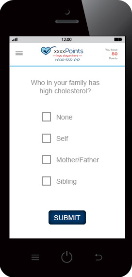
Users were forced to answer questions with text boxes or radio buttons, and then click an additional “submit button” at the end. How do we simplify this process for the user?
UX Solution
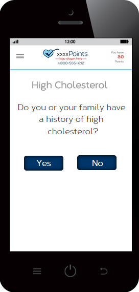
Frame the health questions into yes or no answers so the user can be presented with just 2 submit buttons, labeled either “Yes”, or “No”. This enabled the user to respond with just one tap.


UX Challenge
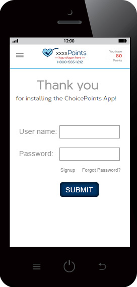
HIPAA laws prevent the unsecured transmission of personally identifiable health data. After downloading the app, how do we immediately engage users when there is a big locked door on the front?
UX Solution
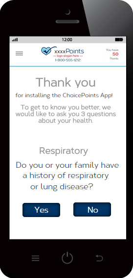
After downloading the app, users can answer health questions anonymously to collect points. When the user is ready to redeem points, a secured login is then required before the transmission of identifiable data is sent to the cloud.

