When logging into an account needed only once per year, I received this message. What does it mean? It doesn’t tell me what I did wrong. Is it me? Is it you? This type of …
Category: Web Industry Blog
Other websites that I find appealing, or can learn from in some capacity.
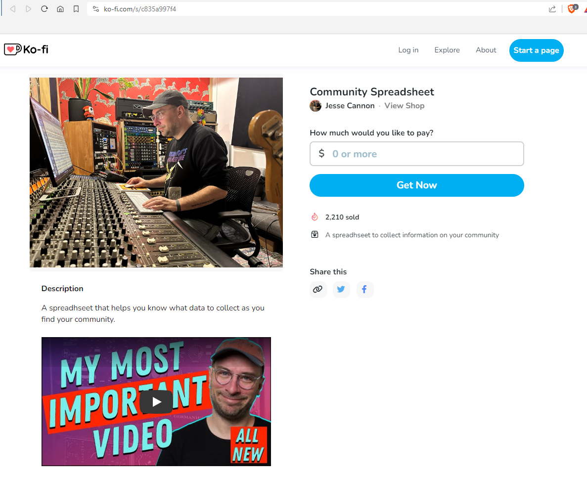
How much would you like to pay?
Example of offering a valuable spreadsheet behind a wall that says “How much would you like to pay?” I can continue on and pay 0 when I give over my email address, which I did. …
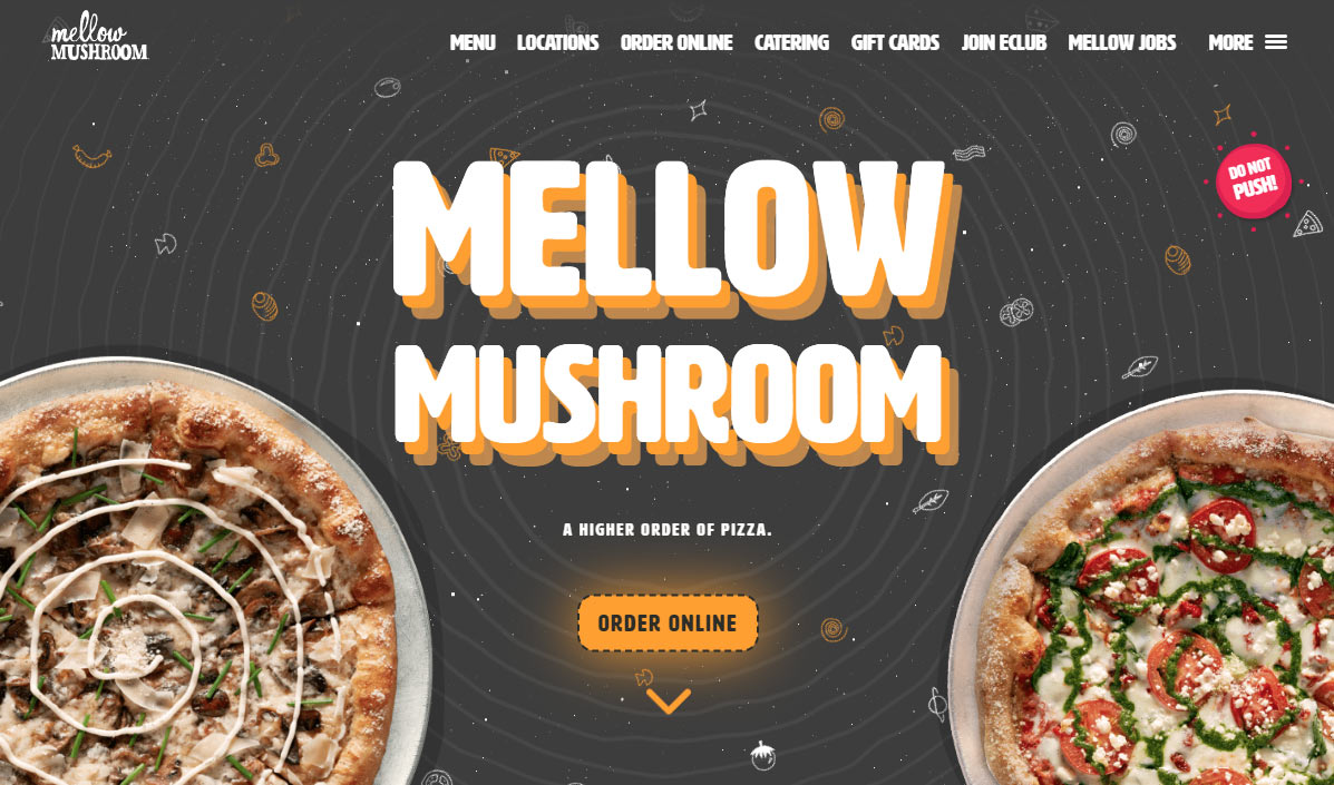
Mellow Mushroom
A 2023 design example that I just love, cataloging here for inspiration. I like the CSS effect that follows the mouse, giving a trippy feel to the title in the hero area. It’s just the …
Mastodon Research
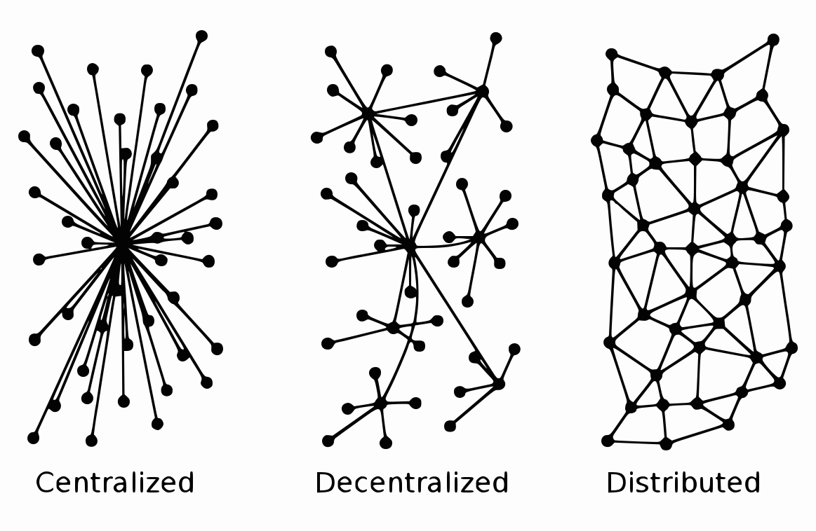
Exploring the history, capabilities, and negative backlash of the web3 social platform. Fediverse, Decentralized, Web3.0 ActivityPub is the protocol used to exchange data on web3.0. Instead of 1 person/company hosting web files (godaddy.com, bluehost.com, etc.), …
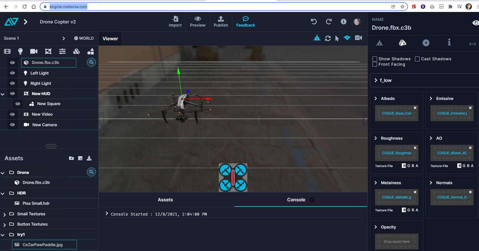
Metaverse and Virtual Reality
To-do learning list to start learning everything you can on virtual reality
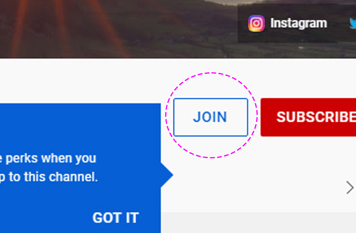
YouTube Join Channel vs the Super Thanks Button
This button is another way of monetizing creators for content. My thoughts on monetizing creators for content I guess is a liberal one. I think this type of subscription model really works and is the …
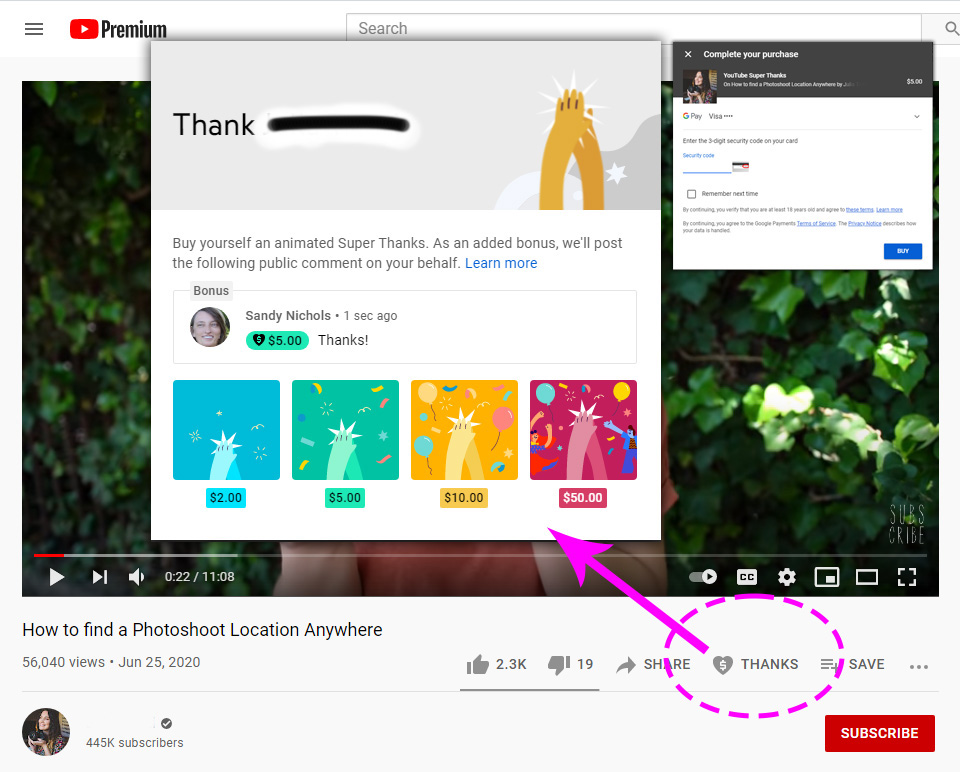
YouTube “SUPER THANKS” Button
I ran across this “thanks” button for the first time. YouTube is calling it the “Super Thanks” button, and it is supporting what I’ve been saying for a while. I’ve talked previously about the accrued …
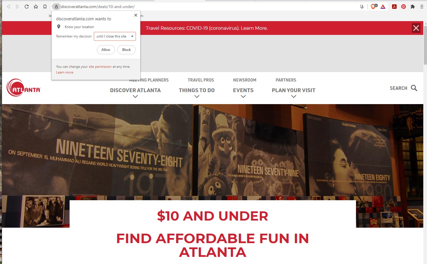
Remember my decision…
This is the first time I’ve seen this. While researching what to do with my senior father-in-law, discover atlanta allows for the option to know my location, but only “until I close this site”.
User Frustration Signals
By collecting, monitoring, and interpreting user data we can proactively see user frustration signals. Some of the signals are: Rage Clicks: repeated clicking on an element Error and Dead Clicks: clicks that go nowhere or …
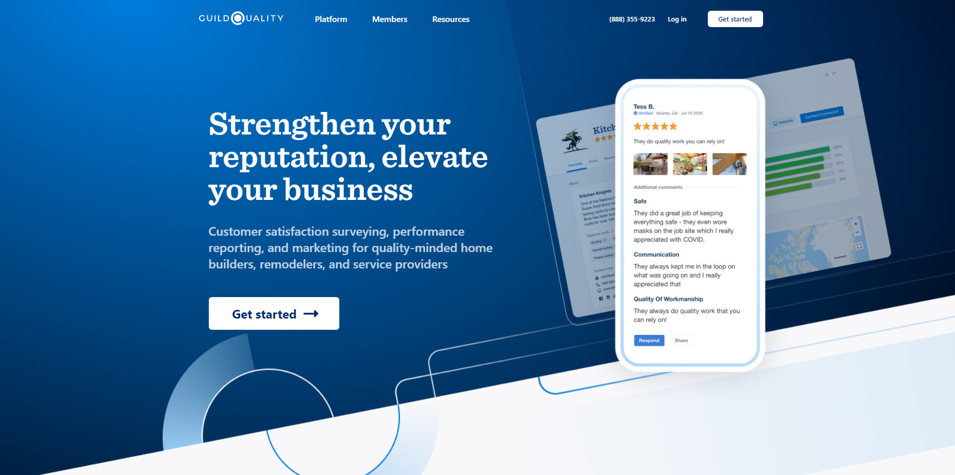
Guild Quality
Overall this site is simple with a strong use of whitespace and it uses color and animation most appropriately in a way to give the user more meaning of the information.
