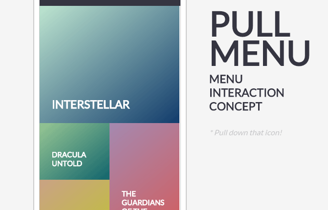
I love the look of this pull down menu. Keeping this link to try it on my next web design project. The menu features big block style buttons with an old 80’s style color-block feeling, except …
Category: Web Industry Blog
Other websites that I find appealing, or can learn from in some capacity.
Customizing the Editor
It feels good to me when I take the time to customize my client’s editor. It is difficult to edit web pages as an end user when the styles of the website are not applied …
Cupcake Pastel Website Example
Website with Illustration and Bottom Nav
Note the bottom navigation. Photography combined with illustration.
Illustrated Trees
Artwork created by Larry Carlson at http://larrycarlson.com/landscapes/
UX Example Help Overlay
I was checking on an order I purchased online (waiting for the delivery, needed ETA) and the tracking link lead me to this website. At first glance, it appears to be an overlay of graphics designed …
News Scroller Inspiration
I like the big-ness of this simple news scroller. The large block feel is easy to read, although I would like it a little bit better without the texture under the text.
Mobile First Web Design
“Mobile First” is not just about a mobile design. It is a strategy that embraces design, code, and saves user bandwidth. Find out what it’s all about.
Responsive Web Design
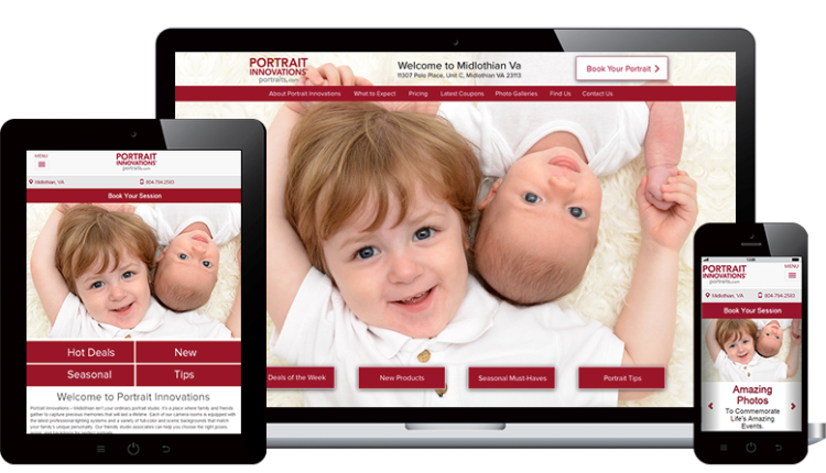
Responsive designs adapt to any screen width. Fonts and images are resized to appropriate proportions so that the user can easily read and interact with the interface.
Web Design & Development
Design can refer to the look & feel of your website, but it can also refer to the organization of your content or how the user interaction is laid out.


