Going to research this link further to find what tools I need to be using (that I’m not already). http://uxdesign.cc/ux-methods-deliverables
Category: Web Industry Blog
Other websites that I find appealing, or can learn from in some capacity.
UX Questions on screen
A few UX questions remotely presented to a user… Overall, how satisfied are you with this website? What, if anything, do you find frustrating or unappealing about this website? What is your main reason for …
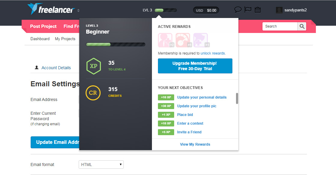
Measurement of level of engagement
The user interface at the top of the website freelancer.com, when hovered over it give immediate feedback on what “level” you are on, rewards you have earned, credits you have, and next objectives… like update …
Retro look graphic design
Love the retro look of the decorative font, but what really got my attention was the background stripes in the shape of a sign.
Usability Tools Research
My healthcare app project has been rapid prototyped and will begin 1st user testing tomorrow within the office. Looks like the recommendation is Track Duck, which I thought I was going to use tomorrow, but decided …
Testing remote publishing.
Testing remote publishing. Installed the WordPress app on my Android. Now I can publish a post write from my phone, and I am going to try using the voice recognition to “type” my text. I …
Quotes
Awesome Quotes: http://blog.hubspot.com/marketing/inspiring-quotes-about-creativity?utm_campaign=blog-rss-emails&utm_source=hs_email&utm_medium=email&utm_content=14068027 Copied from the above website: ” 45 Inspiring Quotes to Ignite Your Creative Spark “To be creative means to be in love with life. You can be creative only if you love …
ProjectSkinMD
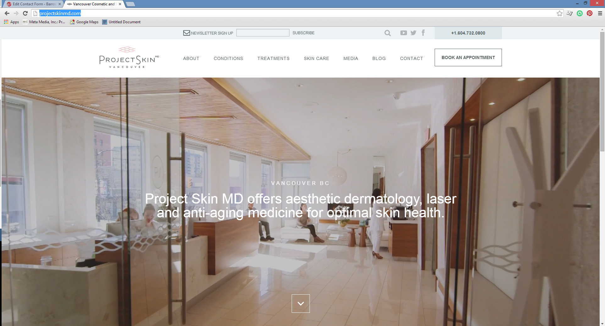
Another example of full width (100%) VIDEO on website home page. EXPECT to see more of this in the future. It’s surreal to finally see today’s bandwidth be able to handle this type of data transmission; …
Fighting Spam
Some references to help fight spam; this is from the Honeypot project. http://www.projecthoneypot.org/how_to_avoid_spambots_2.php I don’t believe in CAPTCHA’s they are way too intrusive to the user experience.
Contact Information in Mega Menu
http://www.completewomencare.com/ This example struck me as more helpful than other contact buttons. Maybe because of the unexpected face in the drop down. Change your Joomla avatar, though. Boo!


