Testimonial design Inspiration: https://www.invisionapp.com/blog/testimonial-page-examples
Category: Web Industry Blog
Other websites that I find appealing, or can learn from in some capacity.
Why We Need UX
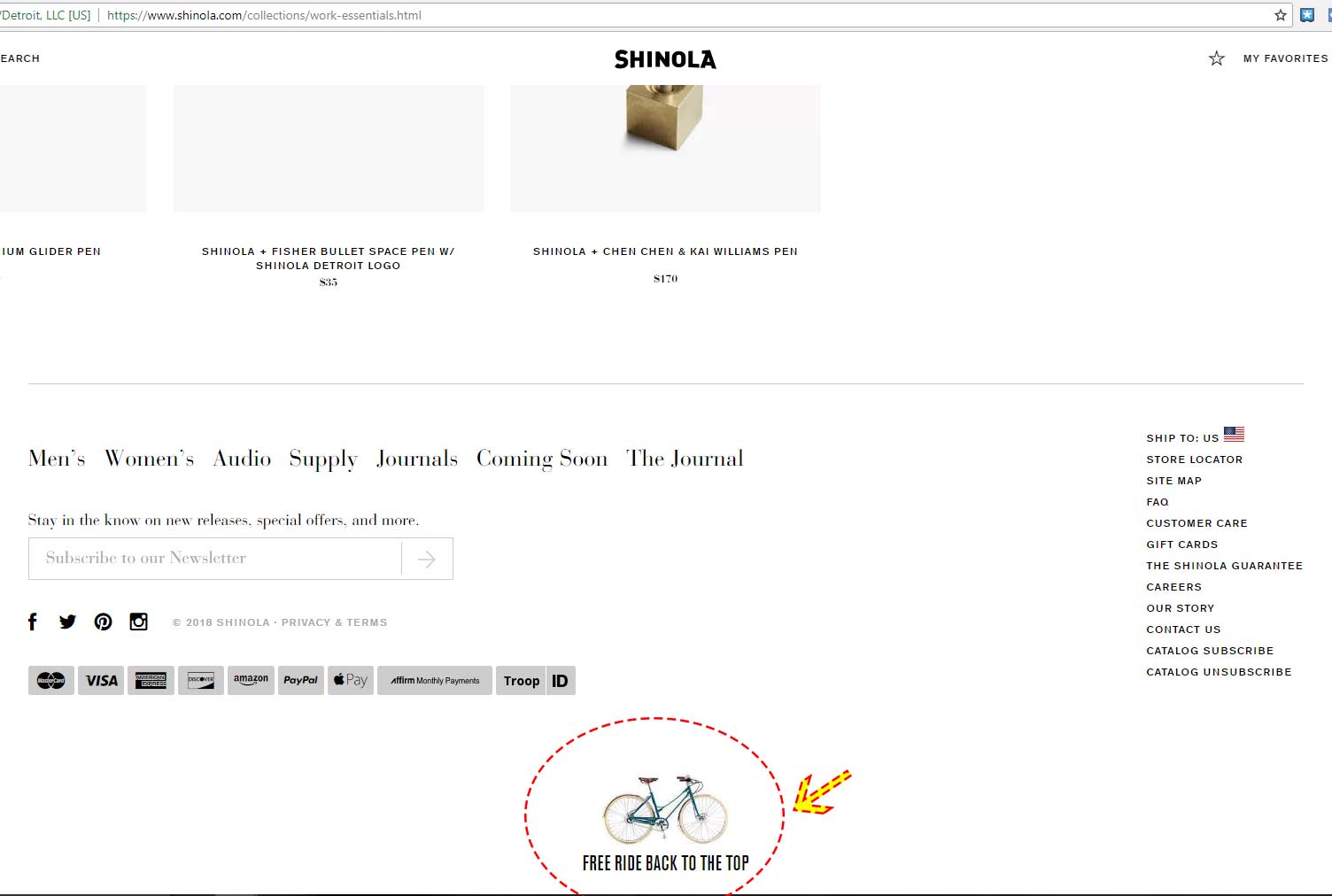
Free Ride Back to Top
Example of cute “Back to top” link at the bottom of the Shinola page. It includes the label “Free Ride Back to the Top” with an image of a bicycle. Why do I like this? …
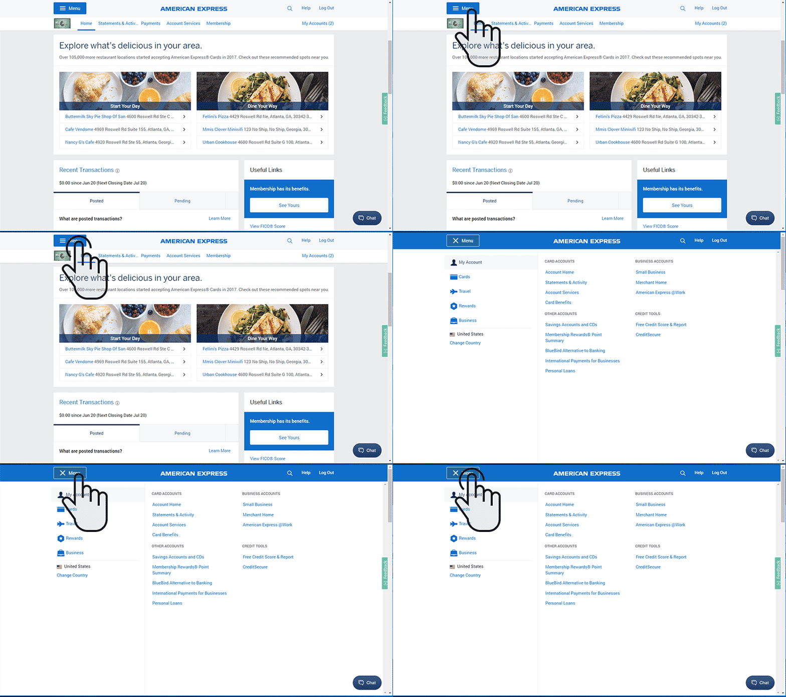
Hamburger Menu Goes Full Width
While checking my account at American Express, they offer a hamburger icon in the upper left corner and instead of a typical drop down effect, the menu goes full screen. I thought this is an …
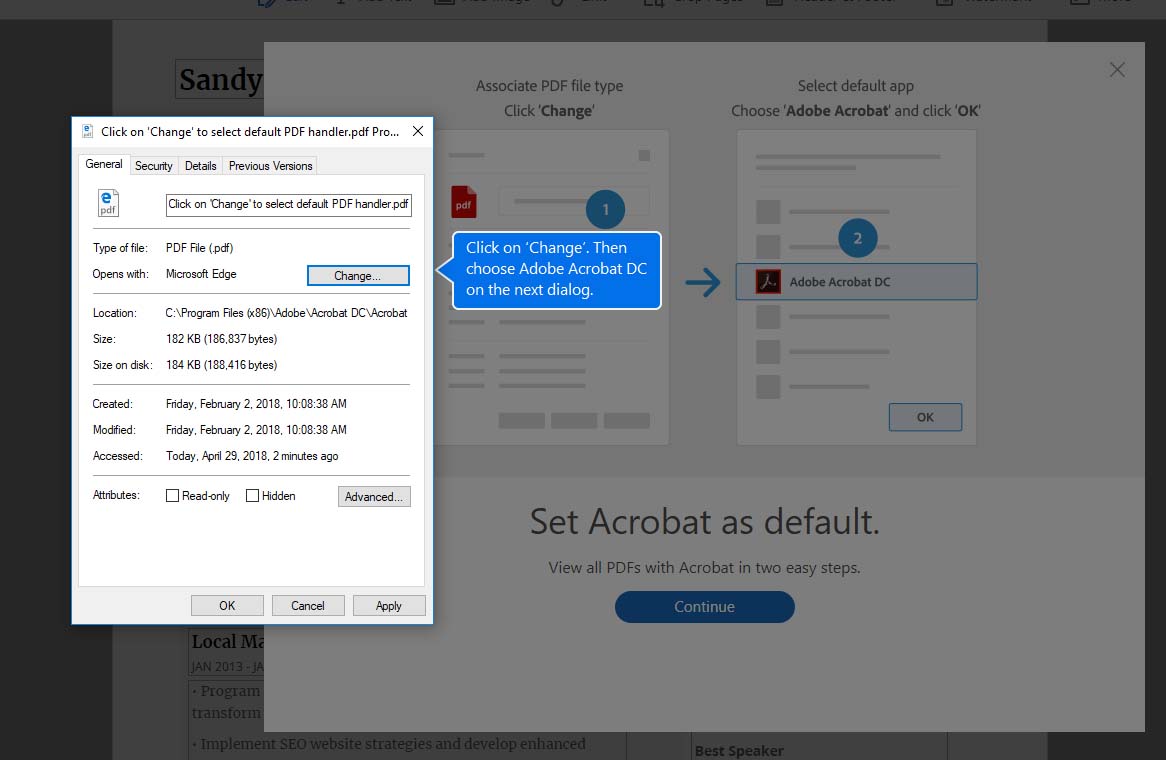
Adobe Attempts to Ease User Pain Points
I purchased a new computer and had to download Adobe’s Acrobat. The software wanted to associate pdf files to Acrobat, so I thought “of course, why not?” and clicked okay (or change, or something). A …
Matching User Emotion in the Buying Experience
If you want me to buy something, you have to match my user emotion at that moment. Meaning, you can’t present something to me, the user, until I’m ready. I am presented with a bra …
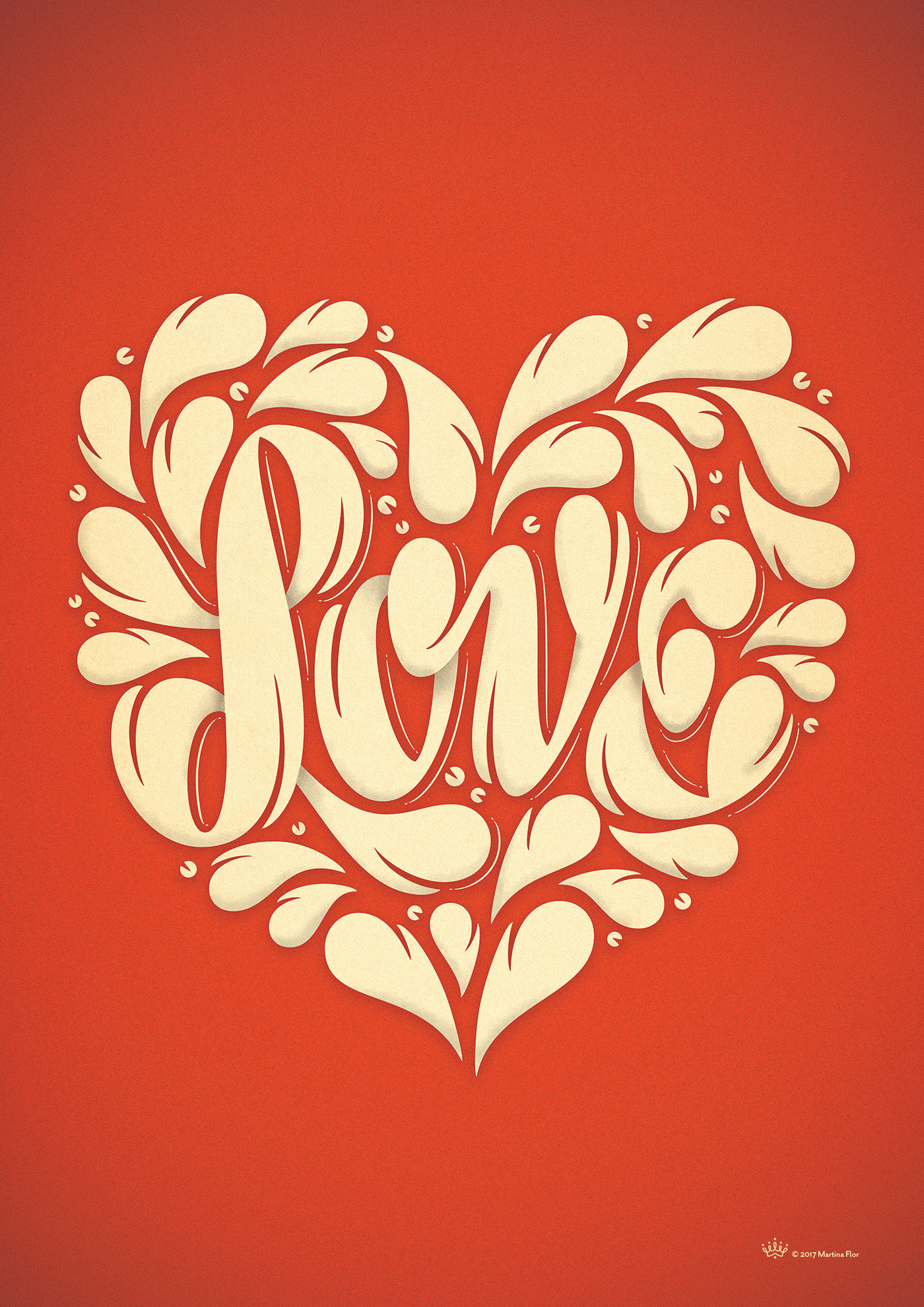
Design Love
An example of design I love. This is by Martin Flor, and it accompanies a Photoshop tutorial on how it was made. Her full article is here.
The only interstitial popup I’ve ever liked
This is the only interstitial popup I’ve ever liked. When visiting a UX company’s website, the contact page presented this: Why do I like this one? It makes me feel like I am talking directly …
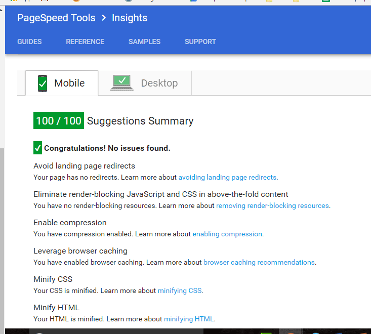
Improving Google PageSpeed in WordPress
I set out to improve my Google PageSpeed score to 100. Through many trial & errors, I finally dumped my current theme and used just the default 2016 WordPress theme. Technically I should create a child …
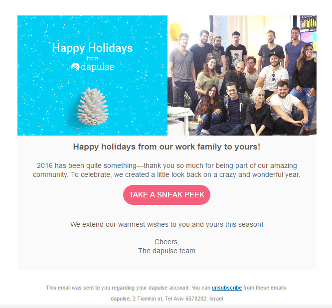
Dapulse Email Example
Here is another example of a style I am a fan of… the showing of the faces of your support team. It adds a human element and it is appropriate imagery for the subject matter …
