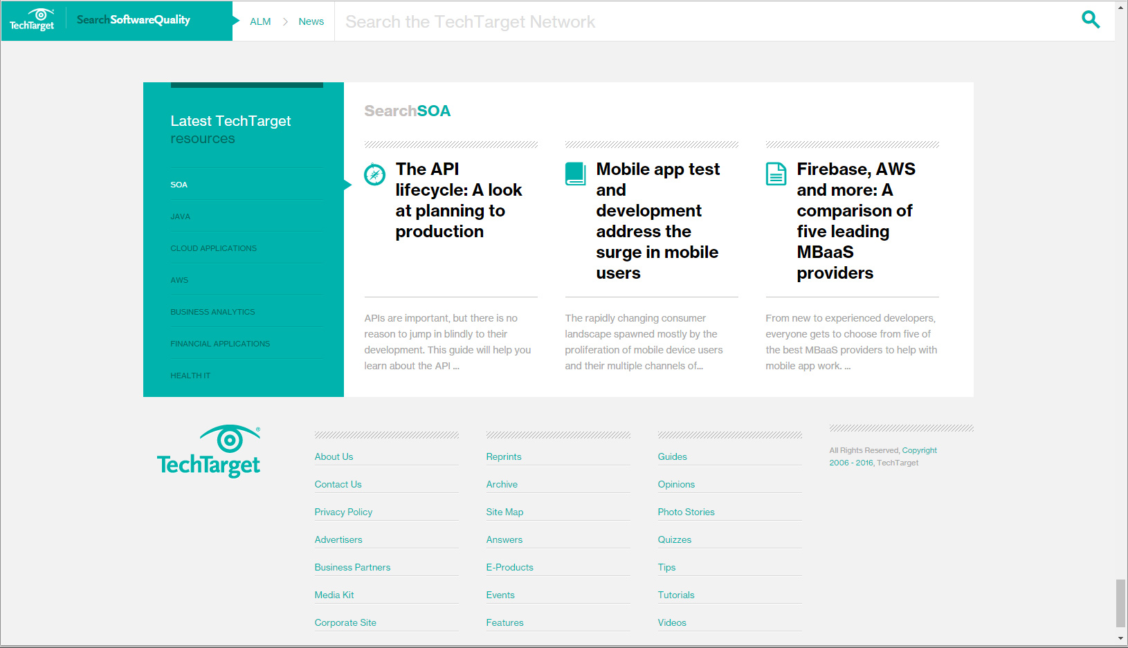
This is the first footer navigation that I like. Usually not a fan of big footers lately, but I like how it can address a subset, more focused part of the target audience. http://searchsoftwarequality.techtarget.com/blog/Software-Quality-Insights/A-modern-way-of-gathering-requirements-Visualizations …
Category: Web Industry Blog
Other websites that I find appealing, or can learn from in some capacity.
Footer Idea
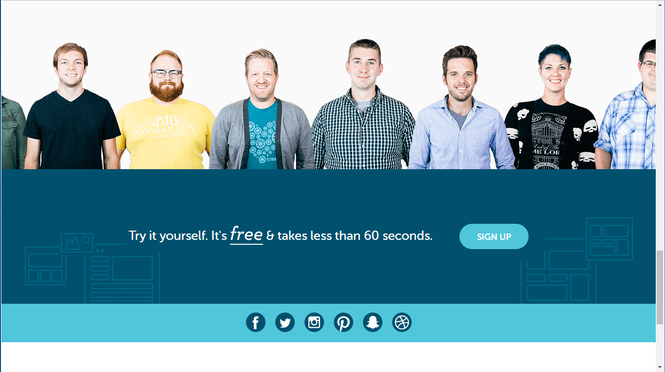
I always liked this type of footer, with the support people lined up to show the real human faces behind the support team or help desk. I wonder if these are the real employees or …
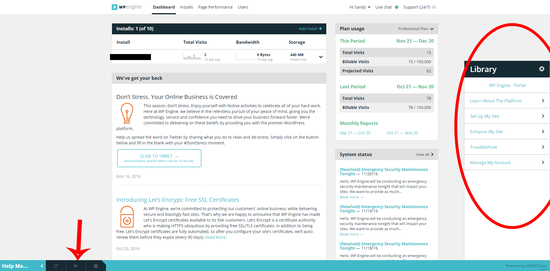
WP Engine Onboarding
I like how WP Engine orientates you to their product, aka onboarding. The help button opens up a sidebar to the right, and if you click on a topic a voice recorded tutorial starts. You …
Finger Wag Usability
He got a real chuckle out of the finger wagging at him. Love a user interaction that elicits emotions. He tried to upload multiple files at once, but the application can only process one at …
Ad Seen in Captcha
I was filling out a form and came across one of those captchas. to get the image verification code, I had to watch an ad first, right in the form.
Email Example
Using as a reference for the next email I have to construct. Emails are not my favorite task, so I cut to the chase and follow good examples that I find. Here’s one from HubSpot. …
Design Inspiration Blog Example
Really digging the design:http://www.fullers.co.uk/pubs
I Can’t Put My Finger on it
I see what you did there. The close button on the ad is so small that I can’t get my finger on the X without hitting the ad button immediately to the left. This is …
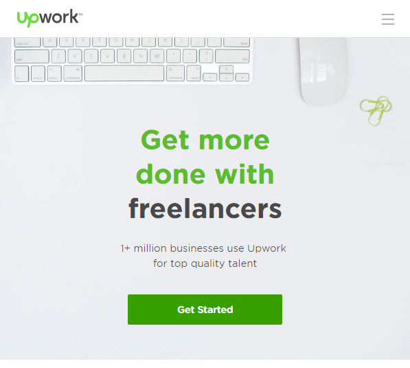
Finding freelance work or workers
https://www.upwork.com/
Emotional Review of the Pop Up
While reading about RankBrain I surfed over to Tim Urban’s website and was presented with this popup, “At least I’m not a mid-screen pop-up”. My dislike for the mid-screen (and full-screen) pop-up is so strong …


