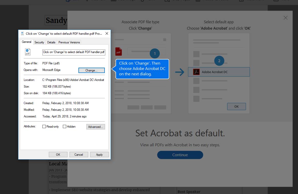
I purchased a new computer and had to download Adobe’s Acrobat. The software wanted to associate pdf files to Acrobat, so I thought “of course, why not?” and clicked okay (or change, or something). A windows dialog box appears to let me associate the files, something I have done an uncounted number of times (and I was a Windows Certified Professional back in the late 90’s). So this is not new to me, but what was new was the “helper” indicators telling me what to click in the dialog box. This was not a screen-print tutorial from Adobe, I was actively interacting with my operating system when the helpers appeared.
This surprised me. I know walk-through methods can be built into software applications, but the fact it was interacting directly with my Windows made me take notice. Why did I notice?
It makes me think Adobe really cares about usability. When I see this I ponder how many hours, weeks, and years it has taken to just get to this point in time where the software is attempting to ease pain points for the user. How much user research did Adobe have to perform to come to the conclusion that THIS is a pain point?
I know it’s really about adoption of the software into the users everyday workflow. That’s why it’s important to Adobe for the user to complete this task of associating the files.
