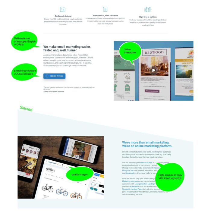
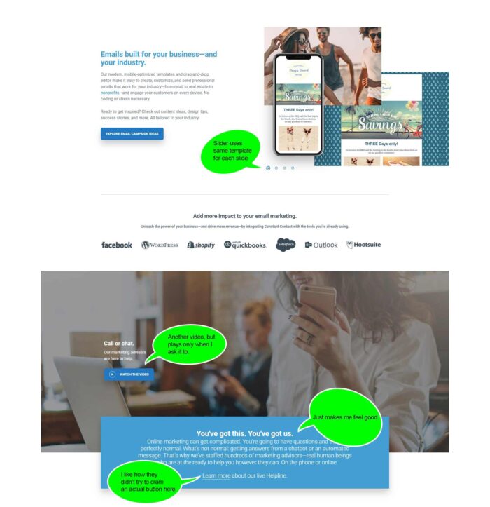
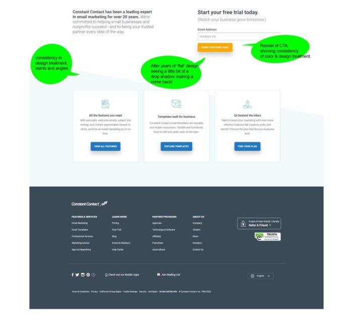
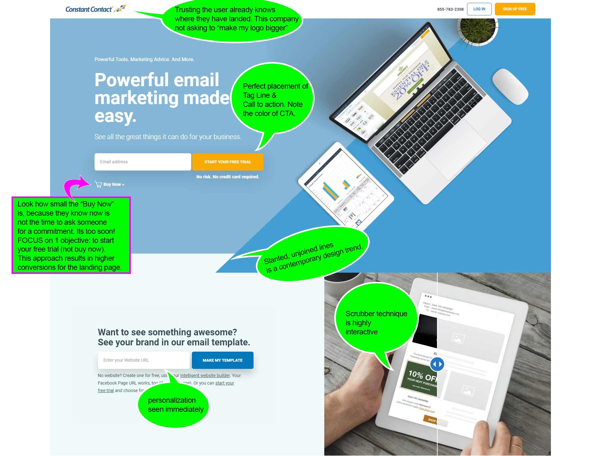
I think one of the most impressive parts of this landing page is how small the “Buy Now” button is. Here is someone who understands that the focus of this landing page is to orientate the user to the benefits of using the product, and it is WAY too early in the process to be asking for somebody’s wallet.
This builds trust.


