I’m having difficulty moving forward on creating an animated chicken on Mom’s website, so I forced myself to get out paper and pencil and allowed myself to explore. What did I want this damn thing to do? I wasn’t sure.
I didn’t want an animation for the sake of just having an animation, it needed to have a purpose. Animation should be used to enhance the user experience. My favorite example of this is when you click a “Buy Now” button and the product jumps from the middle of the page and “flies” to the upper right corner, and jumps right into the shopping cart icon. Now THAT is a useful, beautifully designed interaction that gives the user feedback via animation.
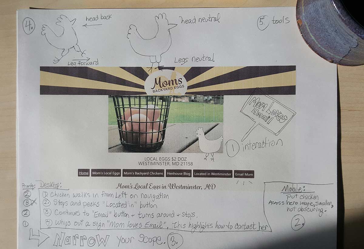
This seems like a lot of work, and I need to wrap up this project within the next 12 days, so with paper and pencil, I created my own project plan:
- Decide on what the animation will do and what the interaction(s) will be. How will it bring value to the user experience?
- How will this translate to mobile?
- Narrow the scope of the work to just the minimum
- Study how a chicken walks
- Decide what tools to use
Step 1 – bring value
Mom doesn’t have a buy button, her call to action is the “Email Mom” and it’s the only way to contact her (Mom didn’t want her phone # on the website). I decided to make the animation walk across the desktop navigation buttons, stopping on the last “Email” button. This should highlight this button.
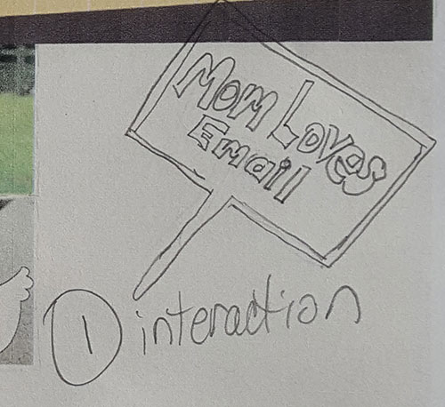
To take it a step further, the chicken will then whip out a sign saying “Mom loves email!” while standing on the button.

Step 2 – translate to mobile
The same animation could be used on mobile, if I wanted to bring a gif to the mobile device. I could also substitute a still image. Since the mobile navigation is collapsed, I will relocate this to the hero image (which is the photo of the basket of eggs). Since the image is highlighting “email”, it should be clickable to the email form. I don’t foresee a problem here.
Step 3 – narrow the scope
I want this project completed in January (2020), so I have 12 days left. After penciling in all the things I wanted the chicken to do, I scaled it down to just the bare minimum… the very least the chicken will do is stand on the email button and whip out a sign that says “Mom loves email!”.
Step 4 – study a chicken walk
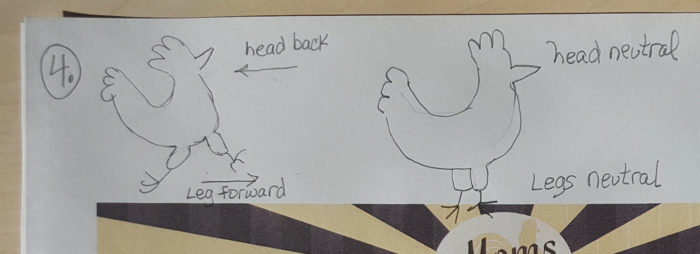
If I can’t draw it on paper, then I can’t draw it online. I studied how a chicken walks to break it down into the 2 most common motions, then I sketched it on paper. This gives me confidence to go to the [online] drawing board.

Step 5 – choose the tools
I’ve procrastinated 19 days on this project because I was unclear on the tools to use to do this. I was set on not using a gif and using pure HTML/CSS, but now that I have a more clear idea of what I want it to do, I have to surrender my original idea of no gifs. The answer is to use a gif for the chicken motions, but use HTML/CSS to move it across the screen. The benefit will be faster-drawn, more realistic chicken movements within the size constraints of a 200px x 200px gif, and that gif can move anywhere across the page… versus, let’s say an 800px x 200px gif that sits permanently across the screen with a probability of blocking or obscuring content.
