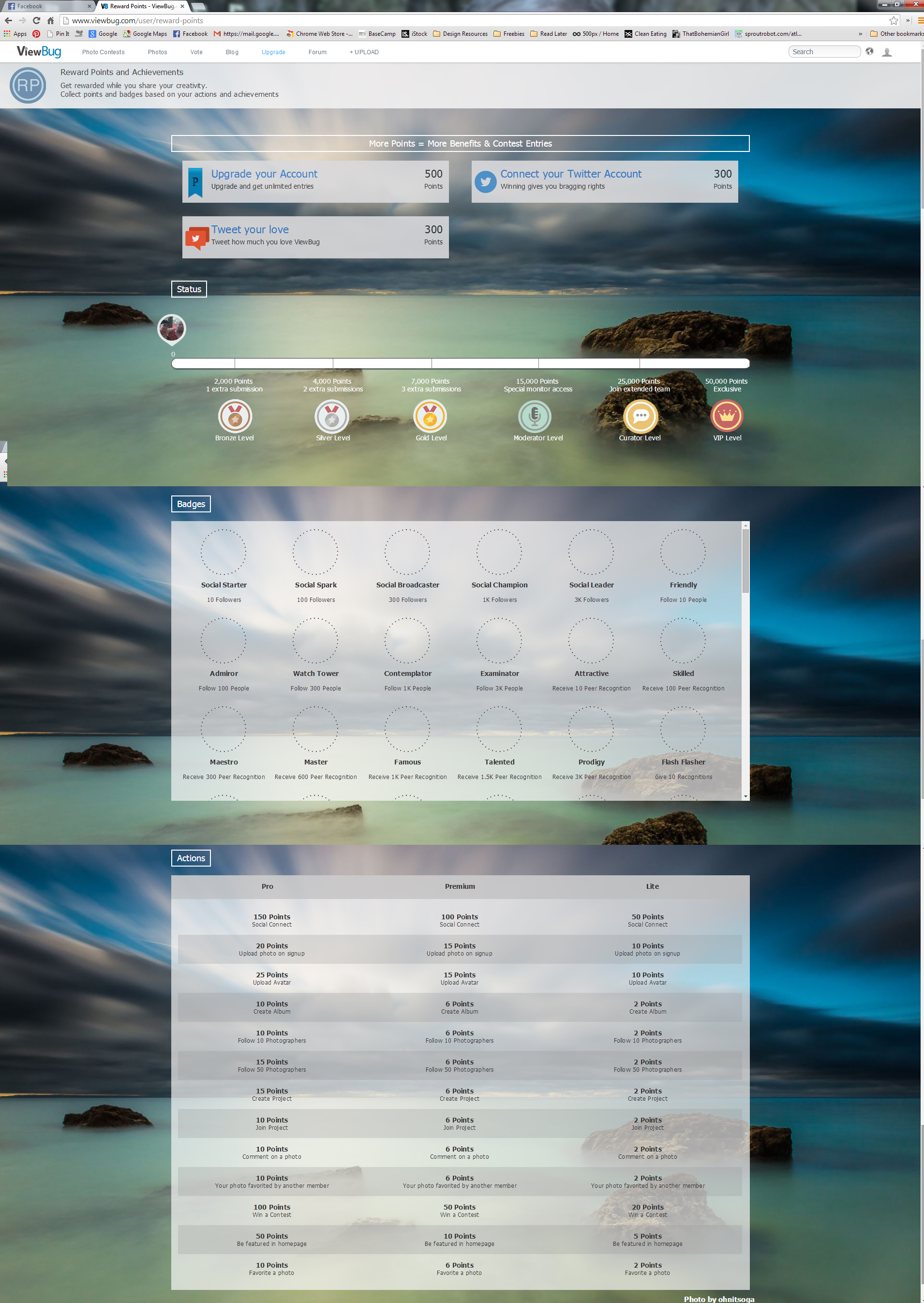
An example of a rewards program and offerings available. Interesting that they use the scroll bars inside the page, which is something I would never do initially, but I think it this case it works and I understand why the interface designer choose this.
Documenting this as inspiration for another rewards program I am concepting for a client.
http://www.viewbug.com/user/reward-points
