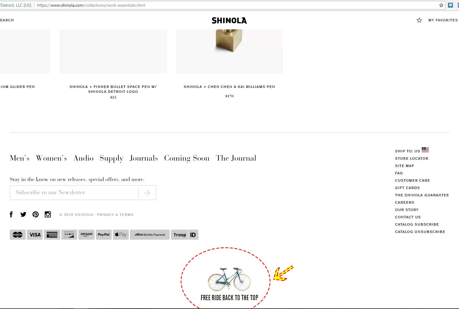
Example of cute “Back to top” link at the bottom of the Shinola page. It includes the label “Free Ride Back to the Top” with an image of a bicycle. Why do I like this? It’s the clever wording combined with the image. The designer/developer could have just left it a “back to top” boring link.
