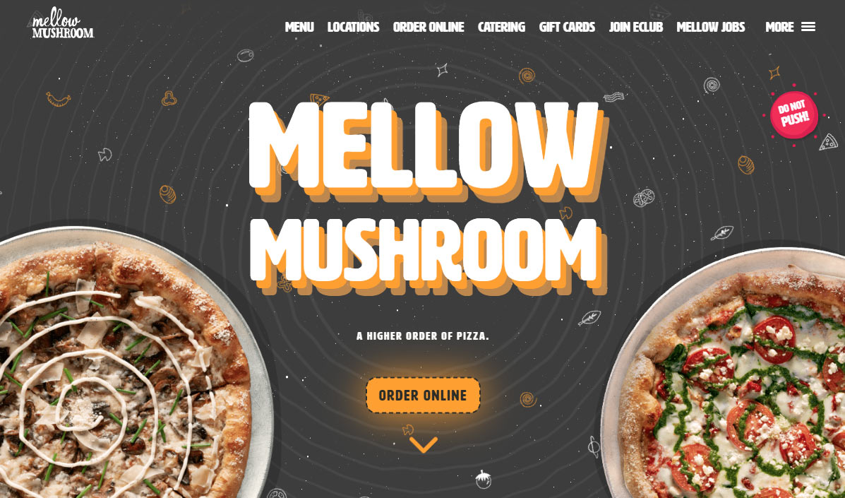
A 2023 design example that I just love, cataloging here for inspiration.
I like the CSS effect that follows the mouse, giving a trippy feel to the title in the hero area. It’s just the right amount of effect/trippy-ness without over doing it. The order button has a hover effect that is extreme, and I also really like this even though it’s negated on mobile (no hover on mobile).
Scrolling down the page, the callout sections are designed with the top & bottom sections at an angle instead of straight across, and alternating a light vs dark design. Down the middle is a wavy horizontal division.
The dashed line around the buttons is also echoed as a divider between the callouts on the bottom.

