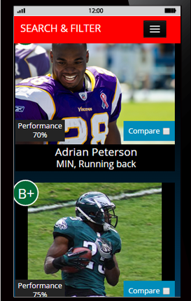
 Mobile first web design is a design and code strategy that embraces the design and code of mobile FIRST, over the desktop. This means that designers design the mobile version of your website before designing the desktop version. Why is this important? Because we are no longer serving up a modified version of desktop to a mobile device. Instead, mobile is thought about first and that forces designers to concentrate on what’s really important. Mobile websites have to deliver the entire message but only in a space about 320 pixels wide (versus desktop 1024+ pixels wide). By thinking about how to deliver the message in such a limiting amount of space forces us designers to concentrate on what pieces of the message are the most important, second most important, and so on. By re-evaluating the hierarchy of the message, we are able to pare down the message to the least common denominator. Once we have comfortably arranged this information into a small space, then adapting the design for desktop actually becomes much easier. When the screen width becomes wider, we can rest assure that the message is already delivered, and we include only the additional information as more screen real estate becomes available.
It’s about saving bandwidth, and reserving the small mobile screen for delivering your undiluted message.
But it’s not just about the design, it’s also equally about the code. Mobile-first means that your mobile code is written first, at the top of your code sheet (CSS) so that only mobile specific assets are downloaded to the mobile device. When the screen becomes wider, then the code can gracefully add on additional images and text to the desktop that is more likely to have appropriate bandwidth to support that behavior. That way we don’t download unnecessary images to the mobile device that are not really appropriate for mobile.
Geek Speak
More information about Mobile First can be found at a Book Apart, http://www.abookapart.com/products/mobile-first by Luke Wroblewski.
