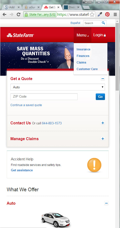
I like how the login is tucked away so you only see the login field; one field login form hanging off the navbar into the hero space. It still has the appearance of a traditional login form, but by showing only one field it conserves on space. It also conserves space in the main navigation because it’s not technically in the main navigation, it is hanging below it. It is technically in the hero space. The juxtaposition of the login field to the login button in the main nav grounds it, and shows what IA family it belongs to in the information hierarchy.
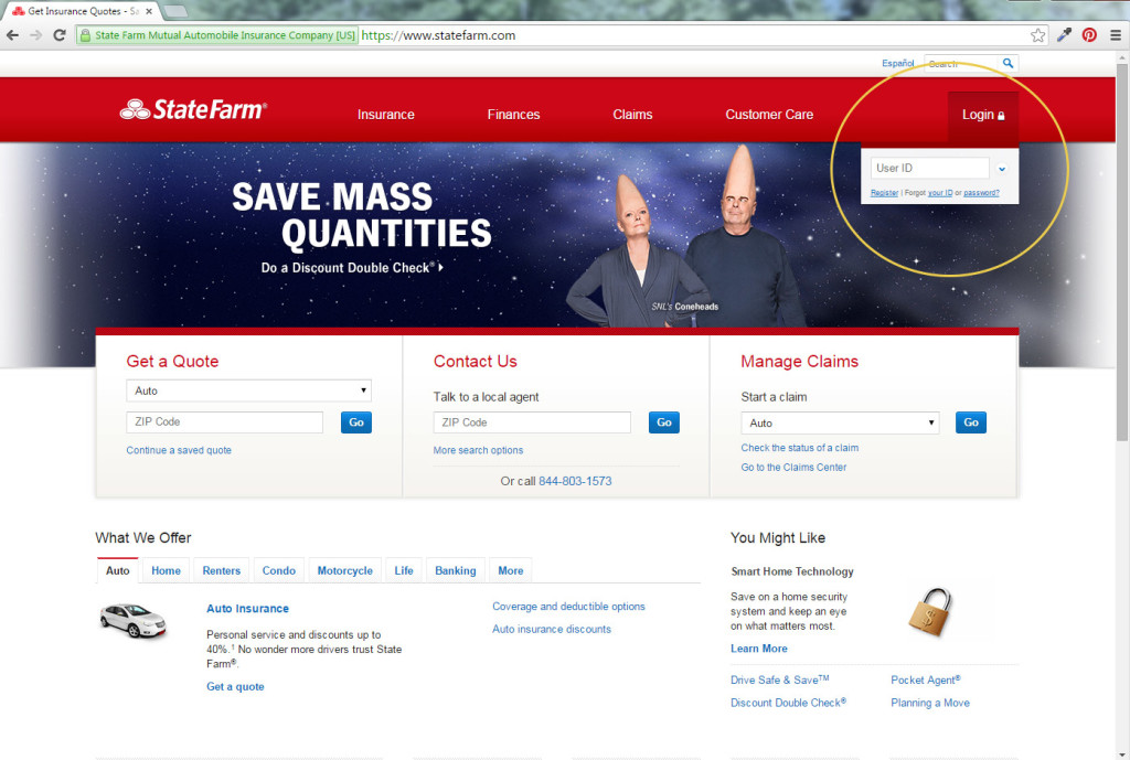
Upon clicking the user id field, then the rest of the login fields are revealed in a drop down style.
There is another little design nugget here that solves where to put the Español and search bar. It’s placement at the top technically makes the header taller, yet, it doesn’t feel like it. Maybe because of the white space at the top almost tricks me to think it’s part of the browser’s chrome. The richness of the designer red is not smashed to the top of the URL bar, and this doesn’t make me think there is wasted space, but rather, very purposeful space.
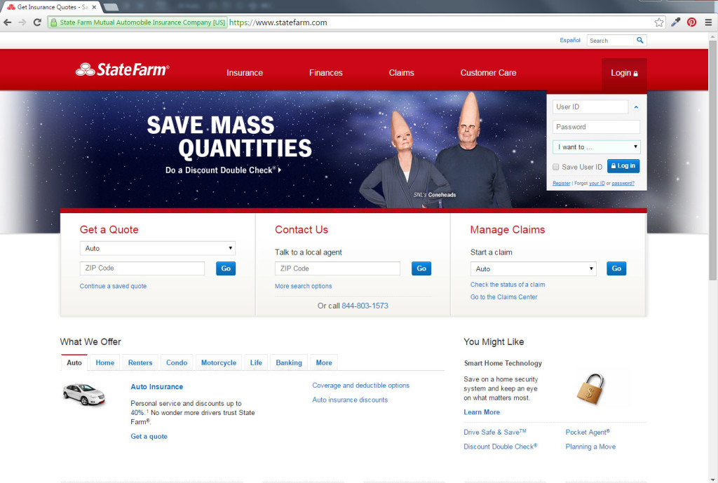
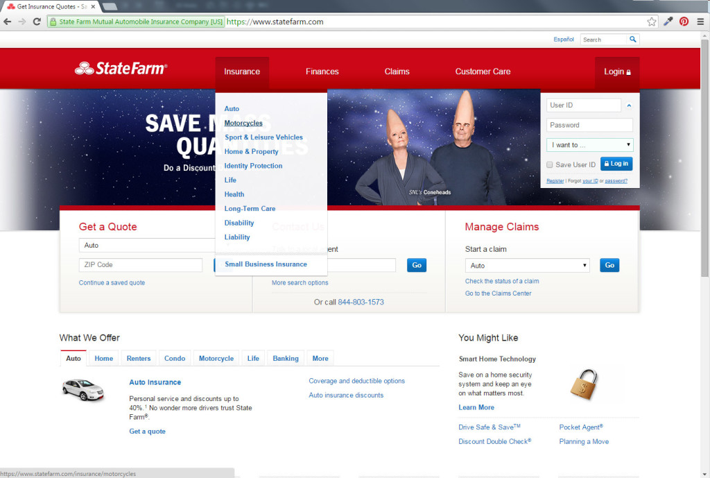
Note the mega tall main navigation. Easy click! Easy touch! Best thing about this type of approach is you don’t have to change your styling between media queries. There is less code and less maintenance.
Handy Dandy logout button is where I expect it
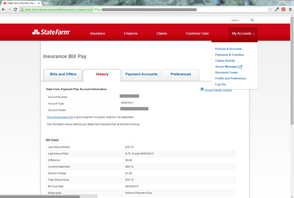
Like how the login button stays exactly the same and anchored in exactly the same place. It’s too important to be tucked or folded into any other menus. The rest of the main navigation, however, gets folded under only one button on the main nav. Note how the one remaining nav button is still mega tall. So the main navigation did not change one bit aesthetically.
