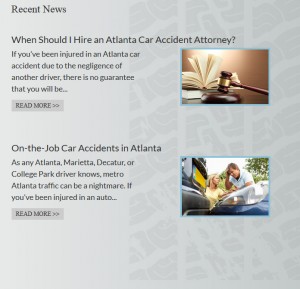
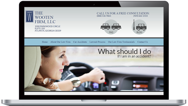
 Sometimes a user doesn’t have a featured image for the post they are writing. This design takes that into account by utilizing a tire tread mark in the background. A featured blog post image can easily sit on top of the tire tread, or the tread mark can stand alone when there are no featured images available, helping to fill unwanted negative space to the right.
This design has amusing rollovers for memorability in a marketplace that is already quite saturated.


