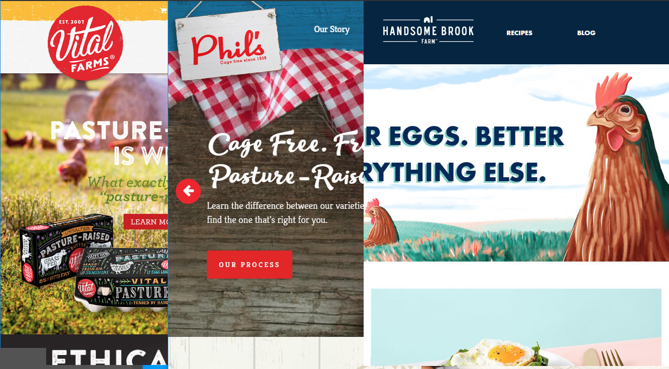
From the research I did for the Mom’s Backyard Eggs website, I selected the 3 most visually appealing chicken websites in/closest to Westminster. Visually appealing means a website that utilizes current website design techniques such as motion or sliders, cute or appealing illustrations, focused photography, but most of all… was the marketing angle clear upon the first impression of the website?
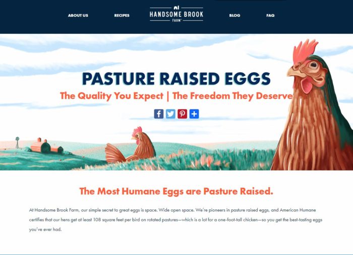
Handsome Brook Farm
Handome’s chickens are pasture raised and is emphasized in the main scroller and in “The Hen happiness Index”. I might have put that graphic more to the top because the user instantly understands in a glance that pasture raised is the most space allotted for a chicken. This operation is a network of farmers with a find-a-store feature.


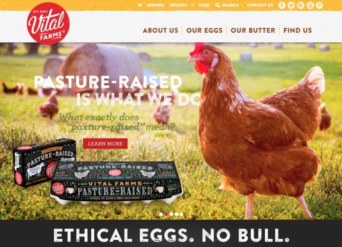
Vital Farms
Vital Farms over-designed (in a good way) packaging shows busy graphic design with little usage of white space, but the hand drawn feel of the flowers and the textured-usage of fill color gives it a home-grown, organic visual feel. The website design compliments the packaging beautifully by repeating the same texture usage in fill color and also stamped into the font. The photography usage is in focus and full of color. The slider has just the right amount of animation.


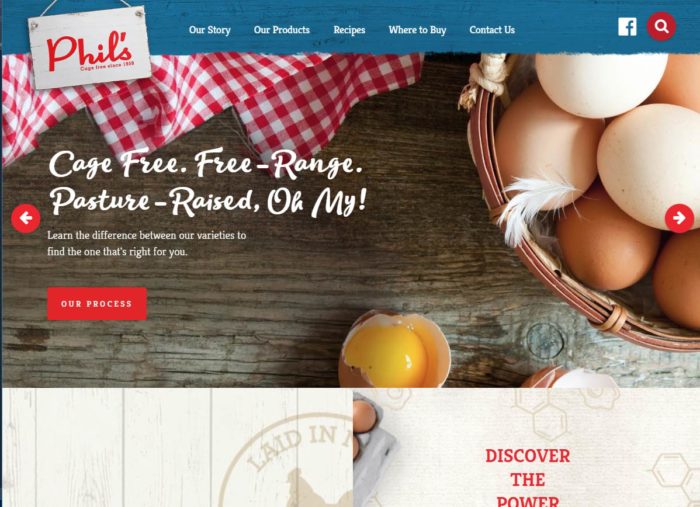
Phil’s
Phil’s has a nice ratio of photography to illustration. Again we see the usage of texture in the fill color areas. Recipes are presented to the user in a completely visual way by showing a kitchen table of food plates that have a clickable +plus sign. Click it and up pops the recipe name & link.


Hours Spent: 4
Tools Used: Internet
