User Flow Challenges
QUESTION: How do we engage users when there is a big locked door in front?
First and foremost is the privacy factor in dealing with any health data. Identified patient data has to be kept behind a locked door, and the only way in is to enter a user id and password. Having someone download an app only to have to enter a name and password could deter the user.
SOLUTION: Immediate engagement. Defer signup process until the user wants it.
Anyone downloading the app was immediately presented with 3 health survey questions and rewarded points. Daily push notifications prompts the user to answer today’s health questions for more points. Users are also able to request doctor’s appointments, read health articles, log exercise, add medication reminders, and browse the rewards catalog. When the user is ready to redeem points or share health statistics with their doctor, the app points them to the signup process which then takes them to a secured server to conduct a transfer of private health information.
QUESTION: How do we present the questions efficiently?
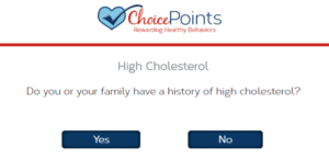
Early examination of the health questions presented a yes button, a no button, and a next question button. By building the submit button into the yes/no buttons, we could present a 1-tap response to the user.
SOLUTION: Progressive disclosure survey questions with 1 click answering:

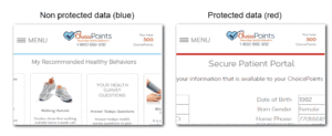
Question: How do we quickly denote protected health data in the prototype?
Answer: Color coded blue = unsecured, red = secured.
In order to portray complex data architecture that combines insecure data with secured data, the color red was used to portray secured data portions and blue for unsecured portions. This was very important for everyone to understand the complexity of protected health data.
