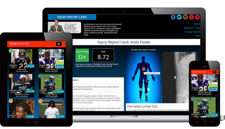
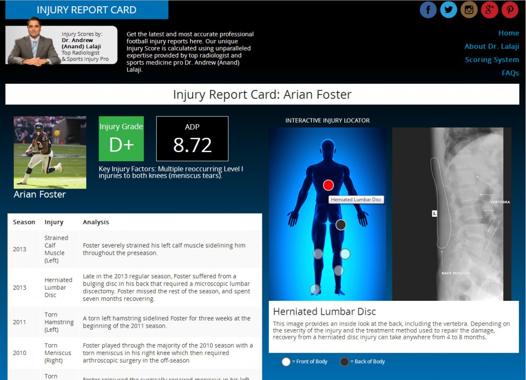
This website was designed for a physician to showcase his prediction algorithm for athletes prone to injuries. The targeted audience was for fantasy football fans. The physician stats were translated into a type of report card, but I felt the project needed more visuals and more interactivity surrounding the location of the injuries.
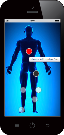
I created the “Interactive Injury Locator” to pinpoint on the body the location of the injury. Upon hovering the dots on the body, a corresponding x-ray is displayed and the dot is highlighted.
Challenges
The hover effect worked well on the desktop, but was not suitable for mobile. Additionally, the x-ray displayed to the right would not translate well to mobile. To improve the user experience on mobile devices, JQuery on touch commands were used to respond to the phone tap, and the x-ray was displayed directly on top of body map with an “x” in the upper right corner. This way the user does not have to scroll to see the x-ray after tapping the hot spot.
An additional challenge was the presentation of injuries on the back body, as opposed to the injuries on the front body. It was common for athletes to have both. Instead of using 2 separate bodies and segregating the injuries, I chose to use only one body to represent both front and backside injuries for a more condensed view. Light colored dots indicated front body injuries, while hovering dark dots (on desktop) instantly switched the body to the back view and displayed the correct x-ray to the right. On mobile, tapping instantly displayed the x-ray.
The Result
The “Interactive Injury Locator” worked extremely well on both desktop and mobile. Being able to instantly see exactly where on the body the injury is located allowed the user to learn about the injuries at their own pace, and was a visual aid for the physician’s prediction.


