Brief Summary
The website provides an easy way for someone to select, and hire, a lawyer. By posting their case details on the website, the user does not have to repeat themselves to each lawyer that responds. The lawyers review the posted details and decide if they will take the case.
Task at Hand
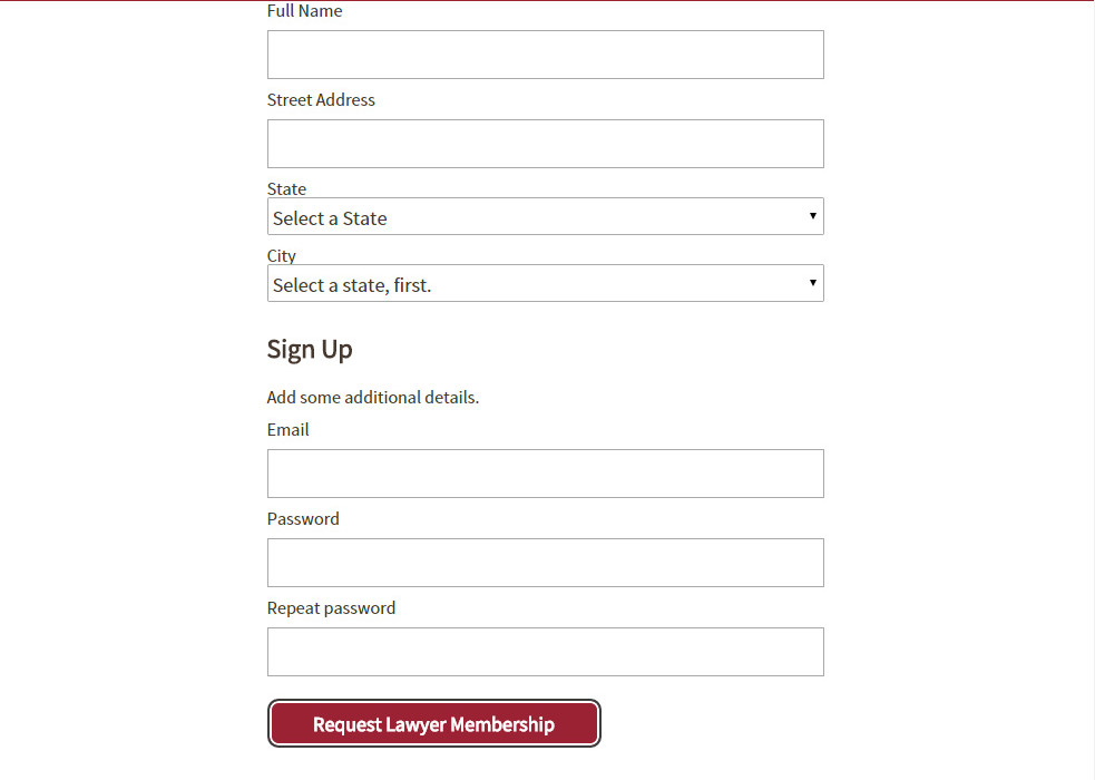
I was asked to test the lawyer sign-up process, because lawyers are users too. The lawyer signup process was complex, and it asked them to claim their existing profile before creating a new profile.
I visited our test lawyer at his office and asked him to “sign up”, without much more instruction than that. I videoed his responses.
UX Challenge
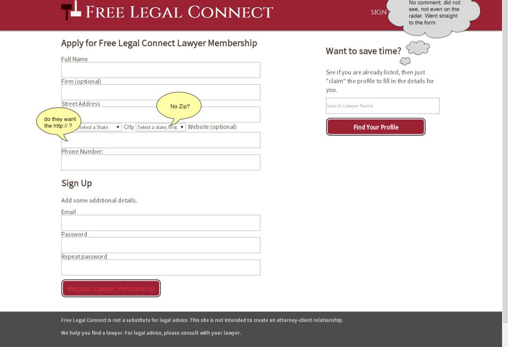
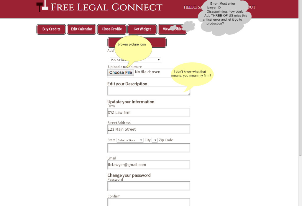
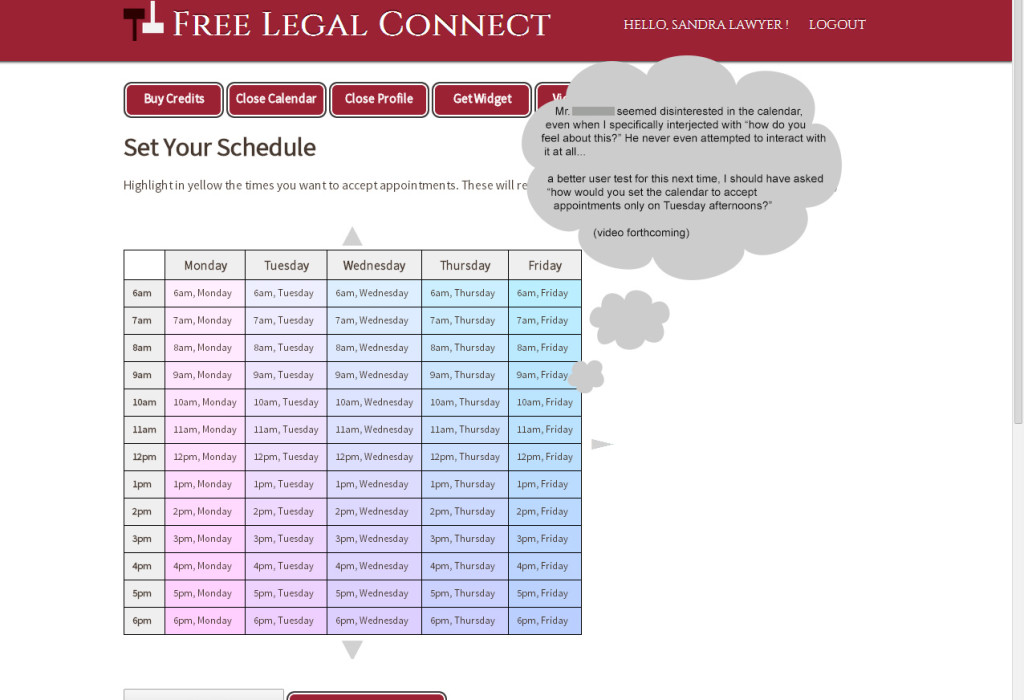
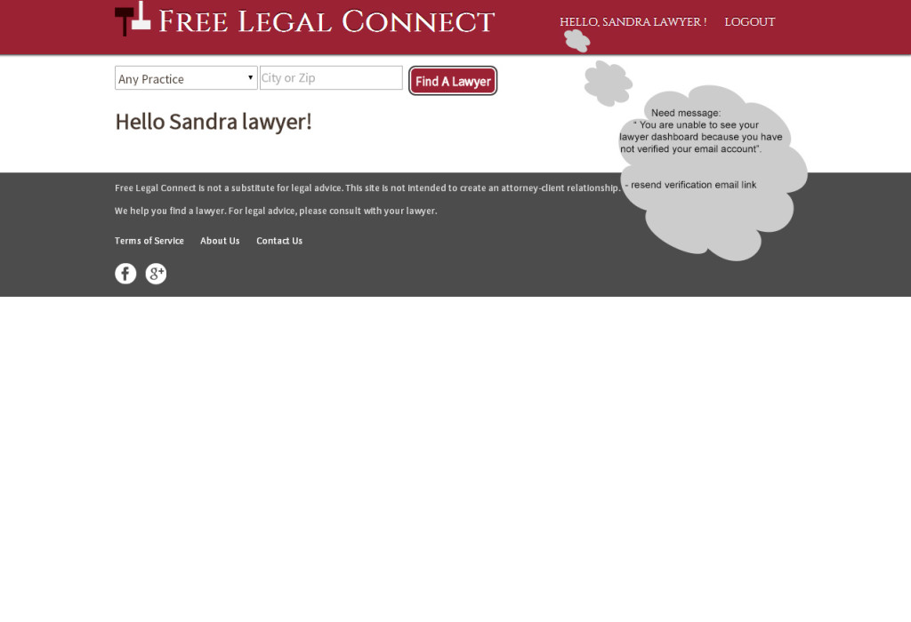
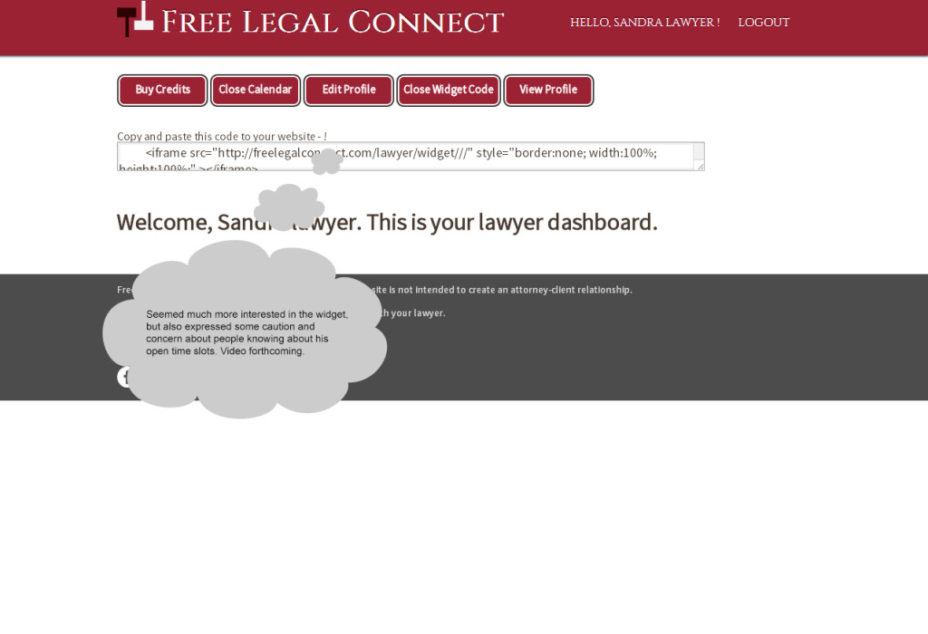
Lawyers signing up with us were expected to “claim” the existing profile on file, but instead they created a new profile, and skipped vital steps such as setting availability times on his calendar.
Lawyer had no idea where to go during signup process…
UX Solution
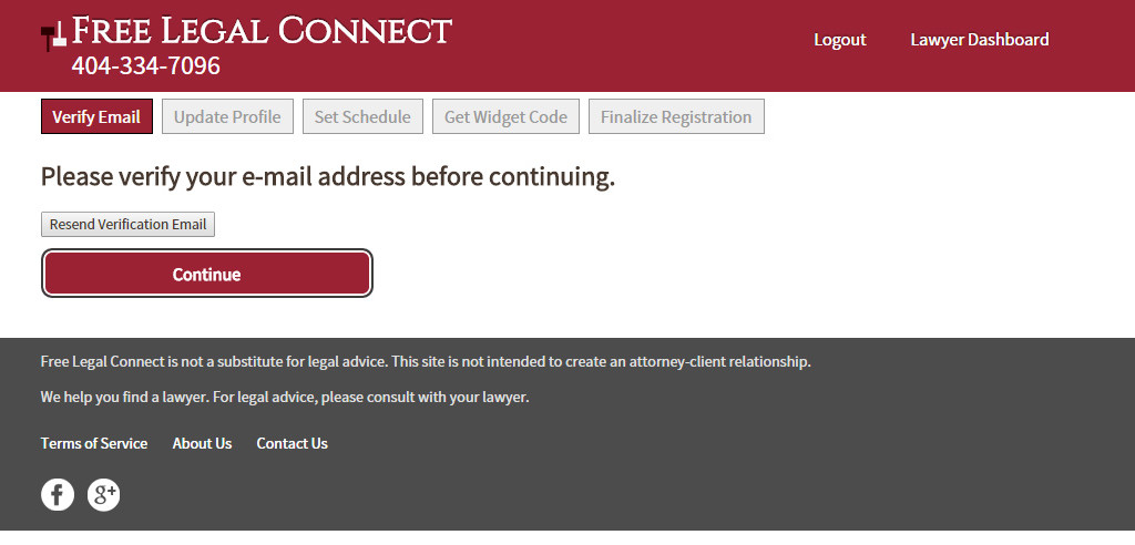
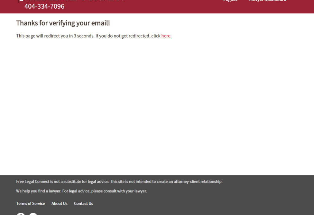
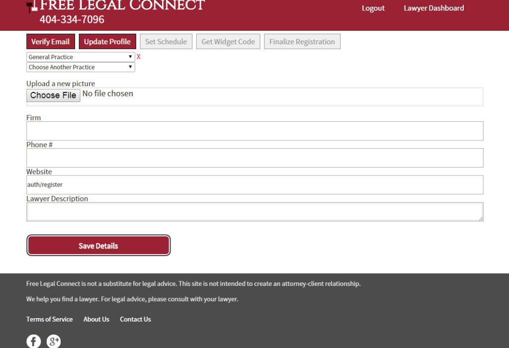
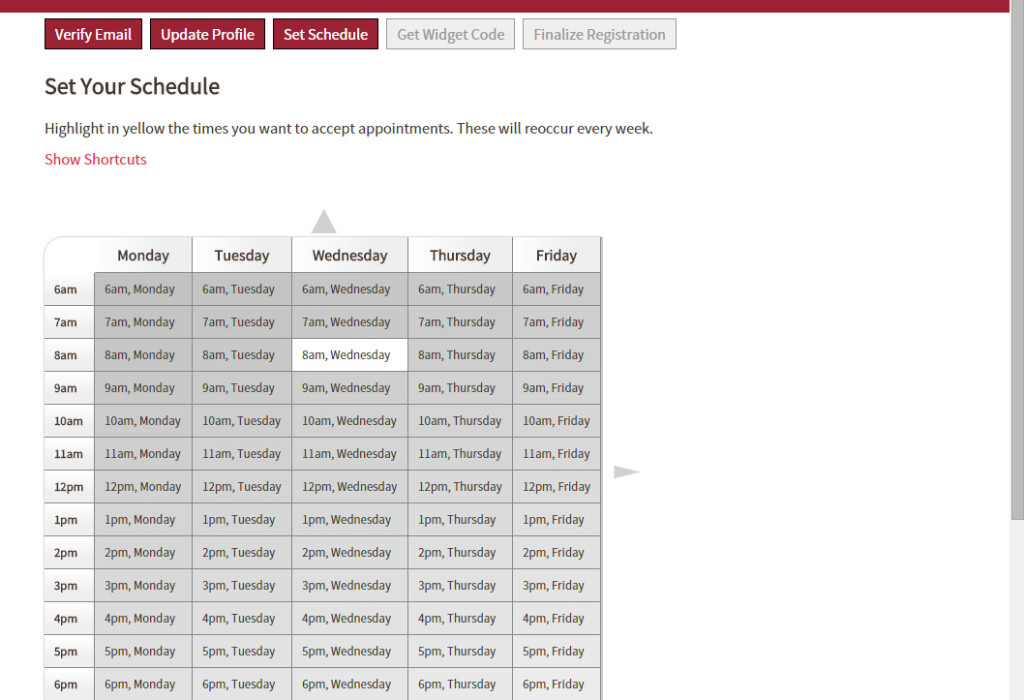
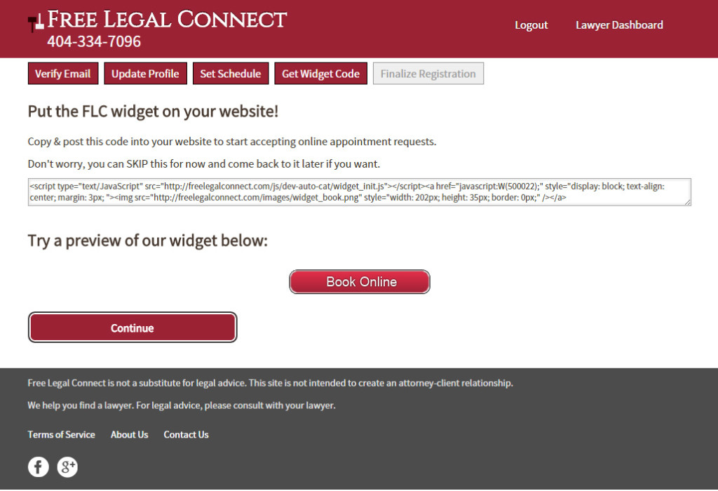
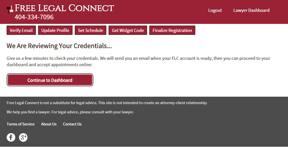
We restructured the signup process using a progressive disclosure approach that leads the lawyer through each step, making it impossible to skip a step and it shows them which step of the process they are on.
Lead the Lawyer through every step…
