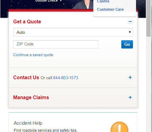
I like how the login is tucked away so you only see the login field; one field login form hanging off the navbar into the hero space. It still has the appearance of a traditional …
Tag: example
User Experience vs. Design
Borrowed from an article about landing pages at Unbounce: http://unbounce.com/landing-pages/7-ux-principles-building-higher-converting-landing-pages/?utm_content=buffera34d5&utm_medium=social&utm_source=plus.google.com&utm_campaign=buffer
