Overall this site is simple with a strong use of whitespace and it uses color and animation most appropriately in a way to give the user more meaning of the information.
Tag: website review
Lisa Nirell Website, by Alter Endeavors
Here is a consultant/speaker website that I really like and might emulate. It looks like a custom WordPress them. How do I build my own story? How do I display storytelling technique on my own …
Analysis of a Well-Presented Marketing Page
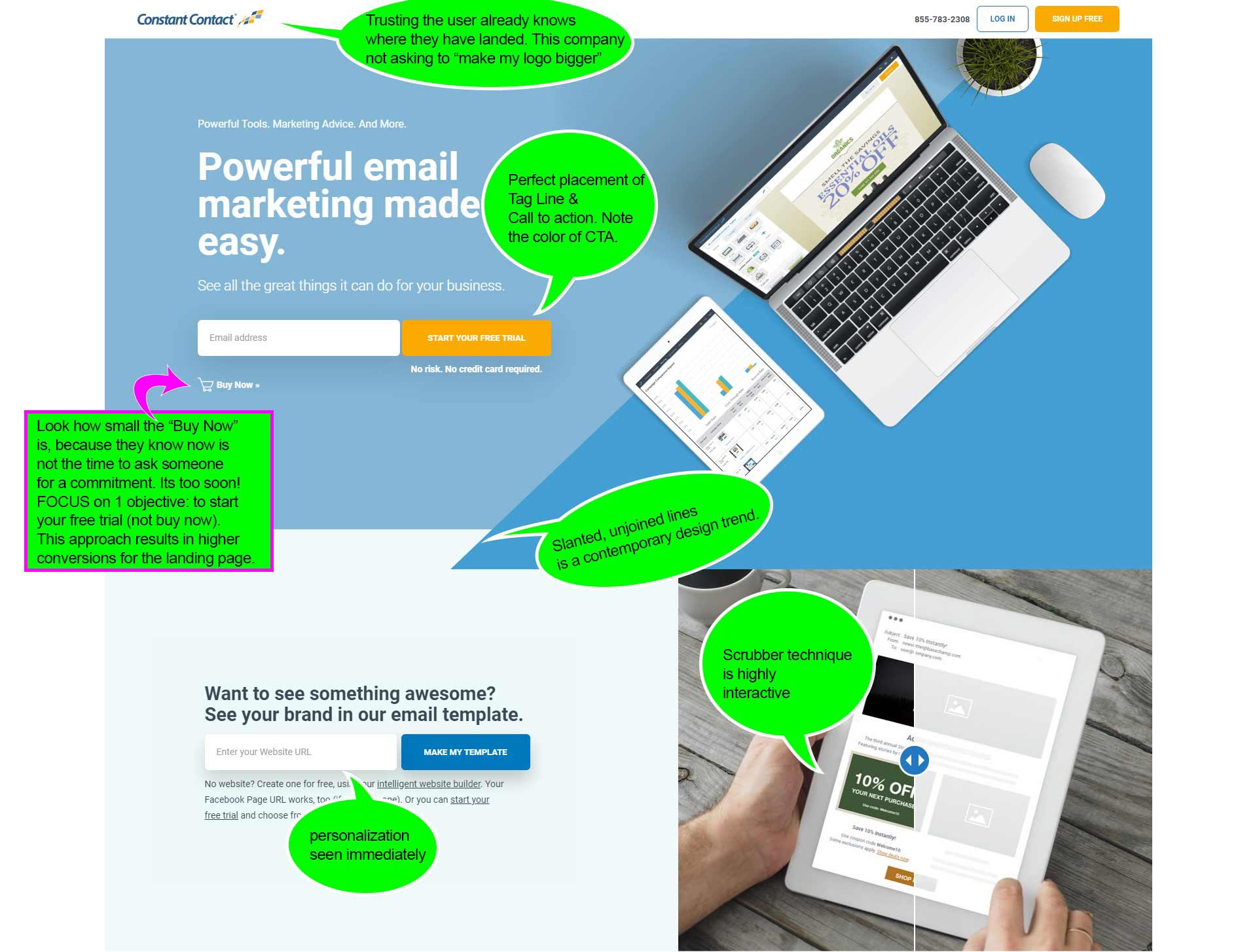
I think one of the most impressive parts of this landing page is how small the “Buy Now” button is. Here is someone who understands that the focus of this landing page is to orientate …


