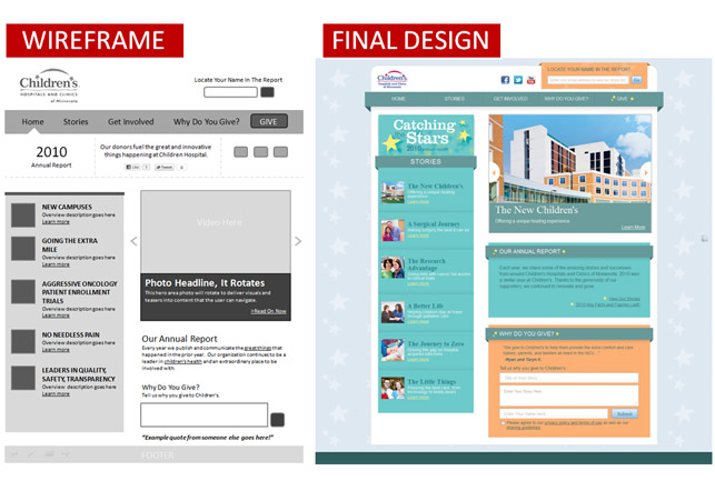
I think I need to present my wireframes more like this example. The wireframe is accompanied by the final design, side by side in one image: http://www.spydertrap.com/blog/2011/07/web-design-wireframes-plan-your-success/
Images
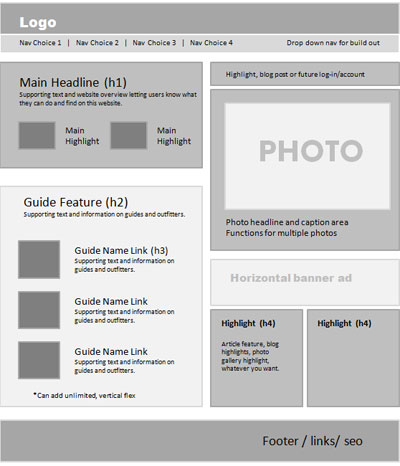
Wireframe Inspiration
Here is some wireframe inspiration: http://www.fivetechnology.com/blog/2008/10/01/web-design-process-a-focus-on-wireframes-layout/
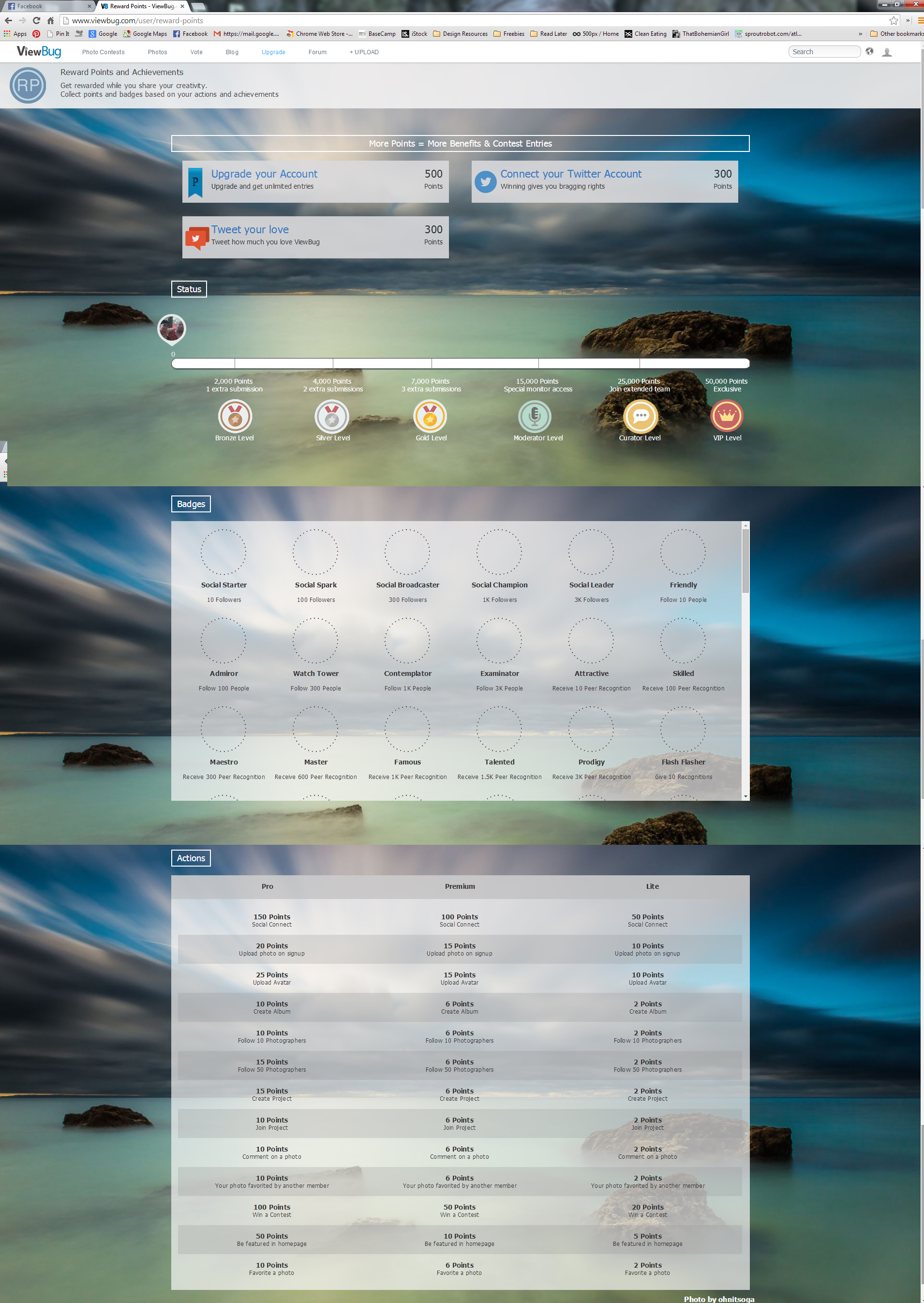
Example of Rewards Program
An example of a rewards program and offerings available. Interesting that they use the scroll bars inside the page, which is something I would never do initially, but I think it this case it works …
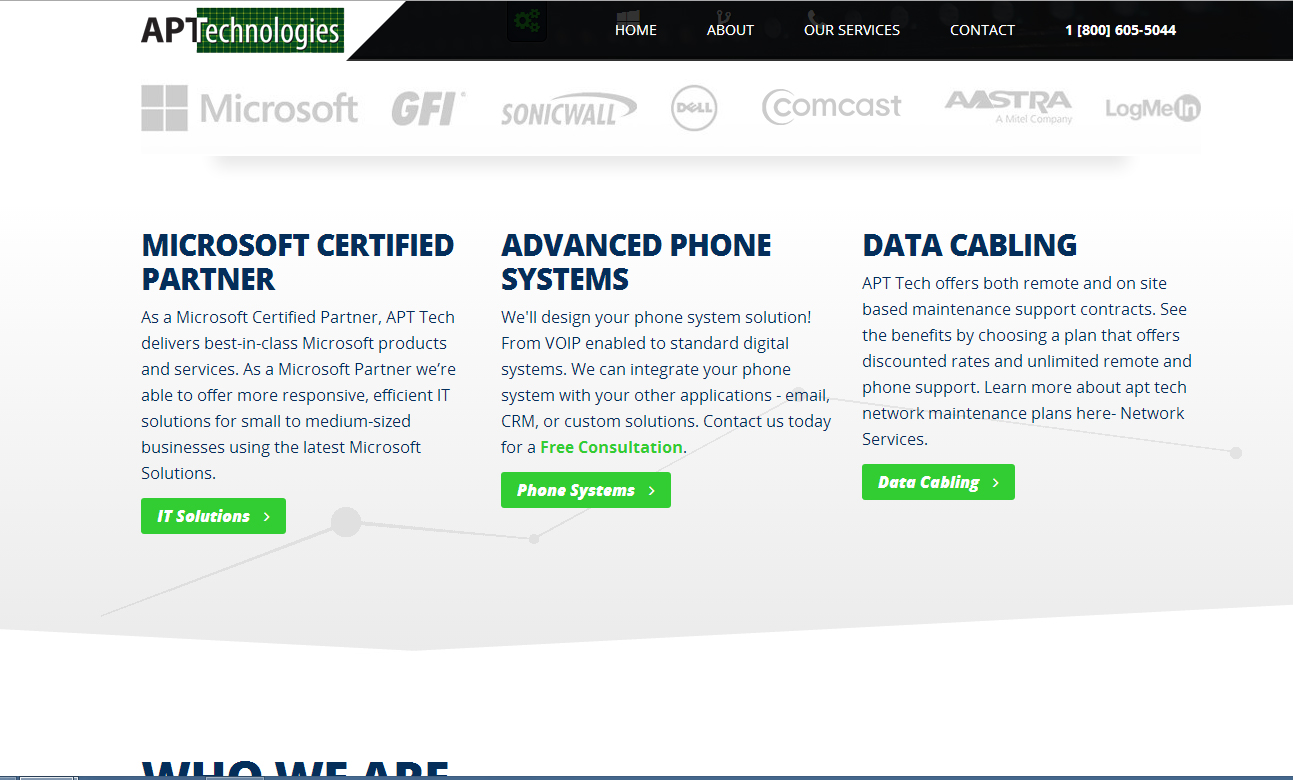
http://aptech.net/
I like the background treatment behind the text. http://aptech.net/
v2interactive
There is something about the simplicity that I like. Good example of creating content for SEO. http://www.v2interactive.net/
Barkbox.com
Full image background Helpful User centered http://www.barkbox.com
